SpintheDistrict.com

One site, many audiences

As a destination event series, Spin the District hosts riders of several disciplines (some for fun, some for competition) as well as spectators and street festival attendees. Its website serves to educate and entice the public to attend, but also to drive the rider registrations and hotel bookings that make the events possible.

For those keeping score, that amounts to at least a half dozen target audiences. That’s a lot of messaging and information to fit into a single web experience. Here’s how Ethic pulled it off.

Launch Site

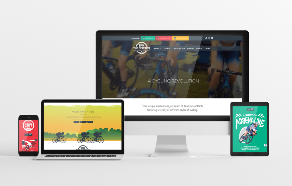
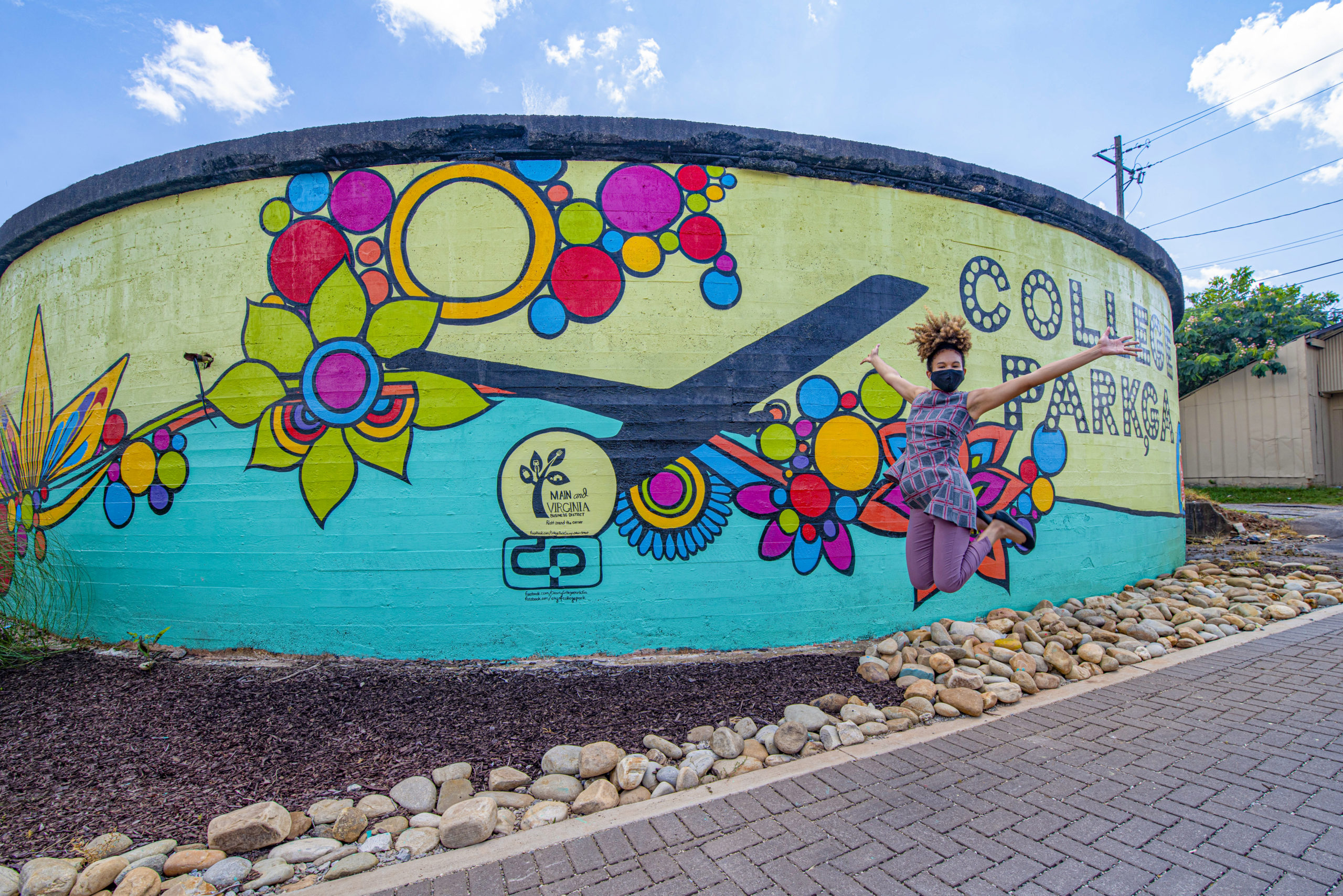
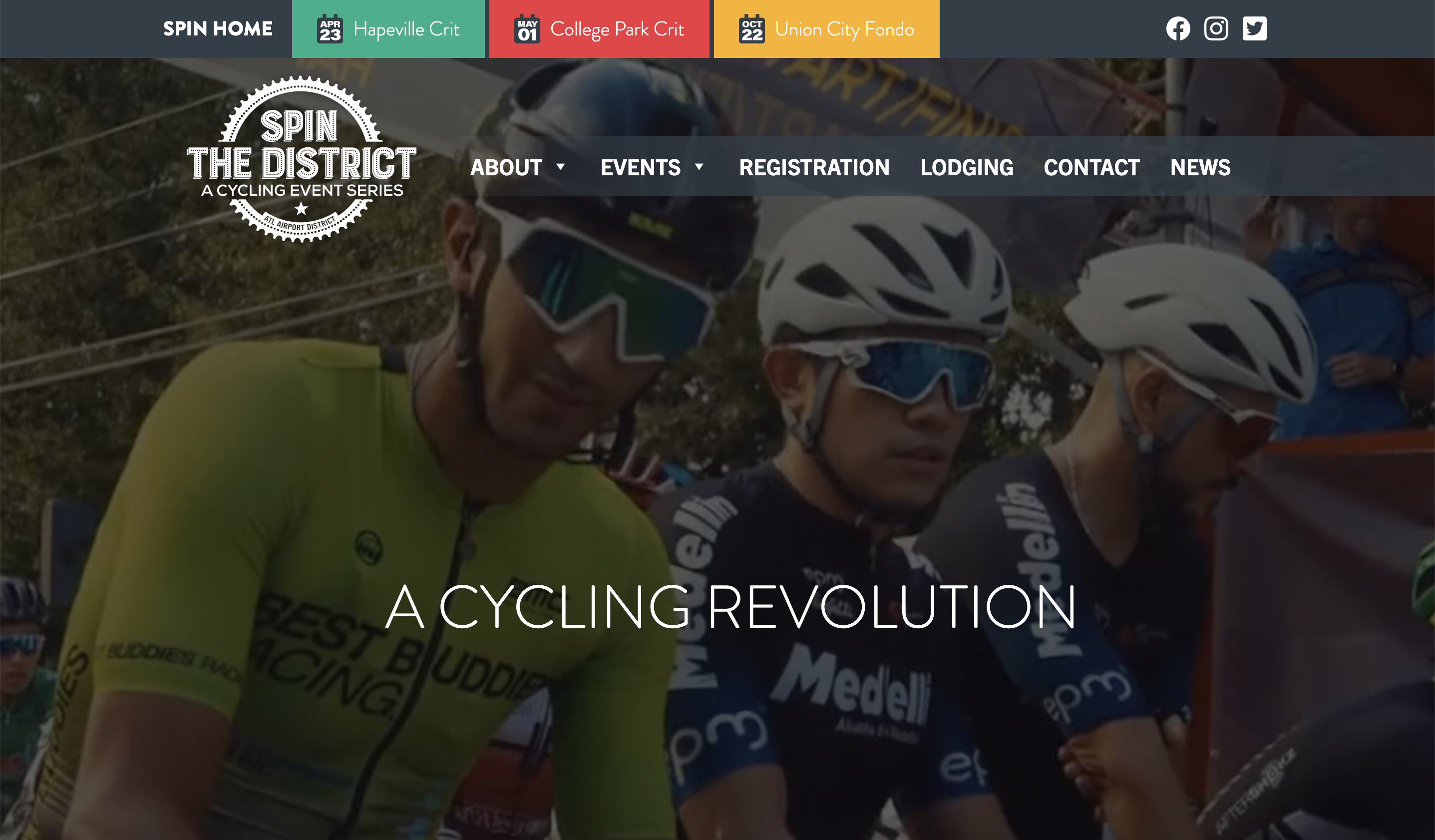
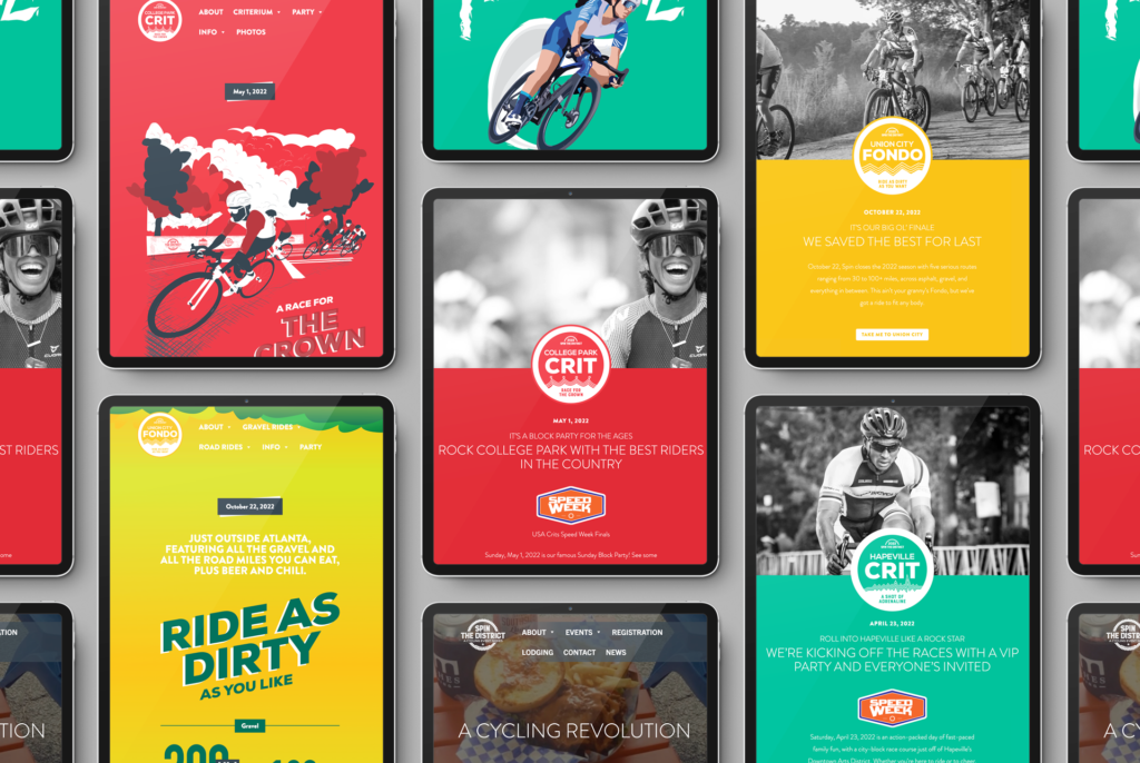
While Spin the District’s brand has remained consistent over the years, the events themselves have evolved into individual styles. Each claims one of Spin’s four brand colors as its own, paired with a unique aesthetic: clean and sleek in green for the Hapeville Crit, hand-etched in red for the College Park crit, and down and dirty in yellow for the Fondo.

To embrace each event’s personality while ensuring a cohesive brand experience for visitors, we kept the home page perfectly true to the classic Spin look (graphic color blocks interspersed with black and white photography), while treating each event as a microsite with its own slightly deviating sub-brand. Navigation within each microsite is consistent, allowing visitors to find the same informational route through every event.

The results are in

Spin launched in 2018, powering through the pandemic years despite being a destination event in a recession that has hit the tourism, travel and event industries the hardest. Nonetheless, site analytics show a consistent growth in popularity, with site visitors traveling a clear path to learn about the events and convert to registered participants.

Member One Gives

Member One Federal Credit Union launched its foundation, Member One Gives, in 2023 with a mission to bring new and better forms of support to underserved parts of its surrounding communities through career programs, charitable giving, and more. Ethic was involved from the outset, participating in the naming discussion and creating a fully-formed sub-brand around it. The logo emphasizes the word “one,” with a single wedge highlighted and offset to illustrate the idea of a whole comprising important individual parts, as is the case for both Member One and the community it serves.

The Member One Gives circle element is new, but it’s employed in a way that echoes the main brand’s “DynamO,” which helps the two brands feel related. The foundation is also tied to the main brand through the use of the standard Member One palette, but with a simple twist: where Member One’s retail side uses its vibrant purple as a secondary color and its comforting light blue as an accent, we’ve simply swapped these roles to give the foundation a distinct personality.

COVID-era Marketing Photography

COVID-19 was tough on everyone, but trying to market travel during the pandemic was almost impossible. Ethic worked with the ATL Airport District, a local Destination Marketing Organization, to shoot some area photography. Showing our audience the reality of COVID life in the District helped to promote more regional travel by educating prospects on what to expect. We think it went a long way toward easing everyone’s fears, including our own.

©2022 Ethic Inc. All rights reserved

Montez Renault Movember

November is an important month for Montez Renault, as a line of men’s grooming products. Ethic jumped on the viral month-long annual moustache-growing event to create a series of branded Movember reminders. We kept Montez front and center for its social media audience all month with little-known ‘stached facts and general get-to-know-your-‘stache posts.

‘STACHED FACTS

‘STACHED AND PROUD

MO’ SQUARED

Member One Annual Report

Member One Federal Credit Union treated itself to the Ethic brand refresh treatment at the end of 2023, shortly before sending out its 2023 Annual Report. This robust interactive deliverable gave us the opportunity to showcase some of the new brand features, from eye-catching colors and gradients to the versatile Thread that flows through imagery and connects ideas.

For a closer look at this annual report, access it live on Member One’s website.

Ascentra – sHELOC TV Spot

When Ascentra Credit Union’s animated mascot Fran needed a break from the endless demands of parenthood and home ownership, Ascentra’s HELOC (home equity line of credit) came to her rescue with a new pool. “Fran is dreaming of lazy days with her favorite floaty, because sHELOC’d it and dropped it on a swimming pool!”

Part of a small series of TV spots featuring a variety of purchases, this thirty-second HELOC commercial was written and created for broadcast, but is versatile enough to be used again online as OTT content.

The sHELOC ad campaign extended beyond video, ultimately showing off Fran’s new pool across print advertising, digital/online banner ads, social media posts, and out-of-home placements like billboards and in-branch plasma screens.

But where did “sHELOC” come from? HELOC products are common across financial institutions, which makes differentiation a challenge in a crowded market. Playing with the phonetic pronunciation of the acronym—he-lock—and attaching it to the idea of “locking in” a lending agreement brought a memorable playfulness to an otherwise dry concept. And of course, once we personalized it for Fran, this naturally became the she-lock that she’d use for her pool, her “she shed” and anything else her animated heart desired.

Visit Sandy Springs Brochure

Visit Sandy Springs Brochure Animation

Ethic’s brochure takes the many, many great things about visiting Sandy Springs and distills them down

to the details that truly distinguish it: the city’s proximity to Atlanta; high-end shopping, dining, lodging

and entertainment; and beautiful, usable, well-maintained natural spaces.

To spotlight each of these attributes, we designed a thoughtful brochure that reveals and redefines

various aspects of the destination as each panel is unfolded. Gone are the traditional restaurant listings

and hotel charts that are virtually always out of date by the time the brochure hits the rack anyway.

That stuff is already on the website! Instead, the brochure is guilelessly aspirational, using genuine

destination snapshots to guide the reader through the experience of visiting this photogenic city.