Ethic® Creative Works created this :30 TV Spot for the Grand Opening of Ascentra’s newest branch. The handmade paperscape was featured in TV broadcast, print and web advertising for the Q1 campaign.
Member One Neighbors TV Spot
Member One Federal Credit Union is all about neighbors helping neighbors. Those with resources to spare can help others get ahead, knowing the favor will be returned when they need it. Ethic® Creative Works created this 30-second animated TV spot to very quickly explain Member One’s origins while showing a cute example of the community spirit that makes the Member One neighborhood a better place.
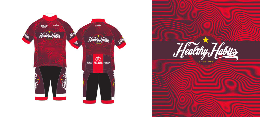
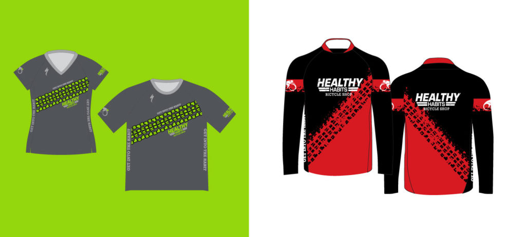
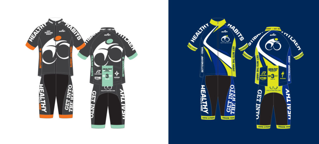
Healthy Habits Cycling Jerseys
One of our favorite bike shops loves awesome swag, so Ethic® Creative Works is always happy lend a hand. Here are a few of our favorite cycling jersey designs over the past few years.
ATL Airport District digital marketing
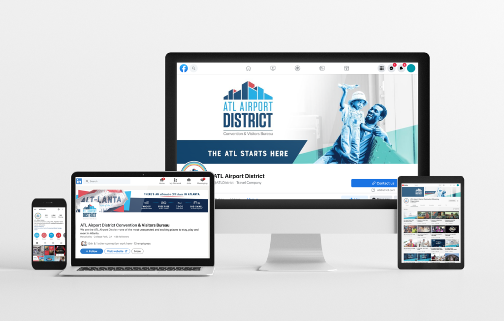
Digital marketing and online content each play a big part in the long and successful marketing partnership shared by Ethic® Creative Works and the ATL Airport District. From simple banner ads to HTML5 embeds, OTT video, and social media headers and templates, we do all we can to ensure the District’s online presence is complete, compelling, consistent, and in keeping with the times.
Video content for the District needs to check several boxes, from catching the interest of the casual social media scroller to dispelling popular misconceptions about the Southside—all while of course marketing the District as the fantastic tourism and meetings destination that it is. The above video was created as a bombastic reintroduction to the tourism market during late fall of 2020, when U.S. travel was reopening after widespread pandemic panic.
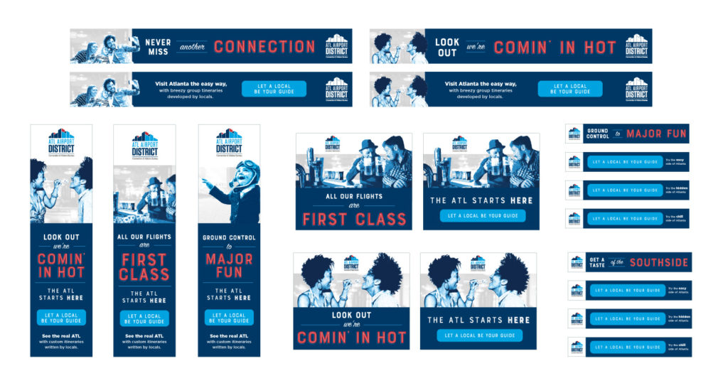
As an ongoing digital echo of its main brand and current campaign, the District’s banner ads feature the same bold brand color usage and punny transportation-forward headlines. While the look and messaging evolve alongside our broader traditional advertising campaigns, they are always distinctly the District.
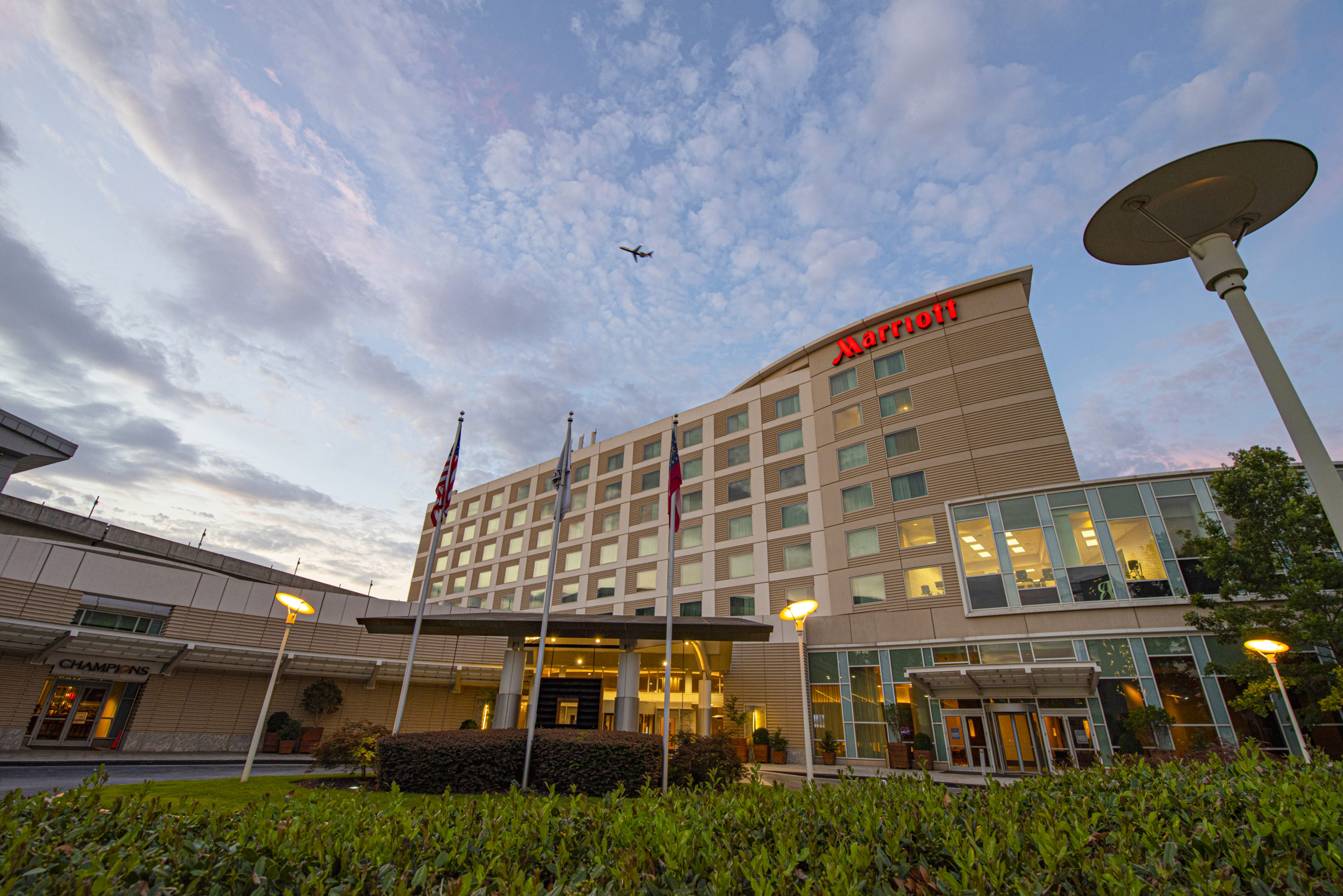
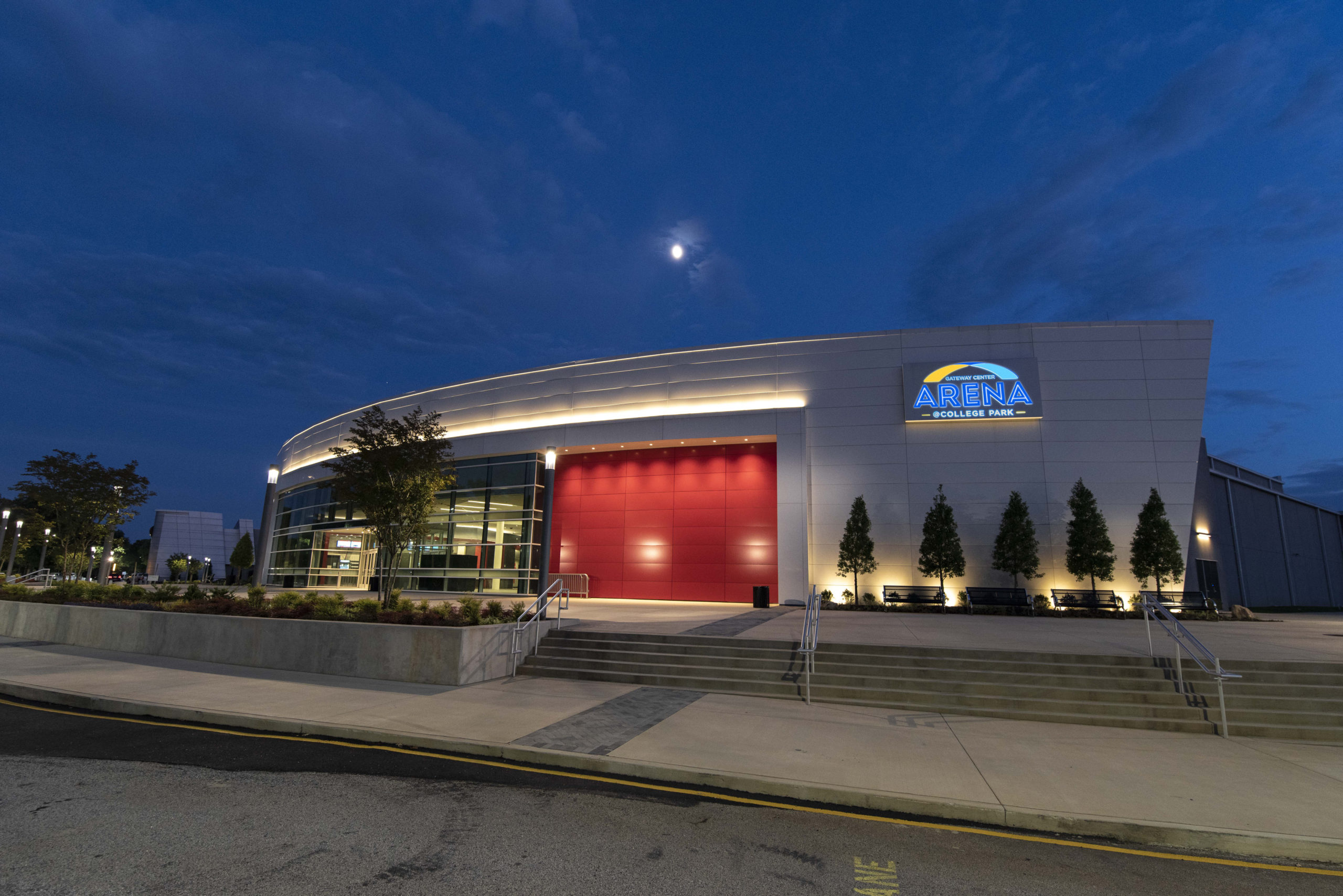
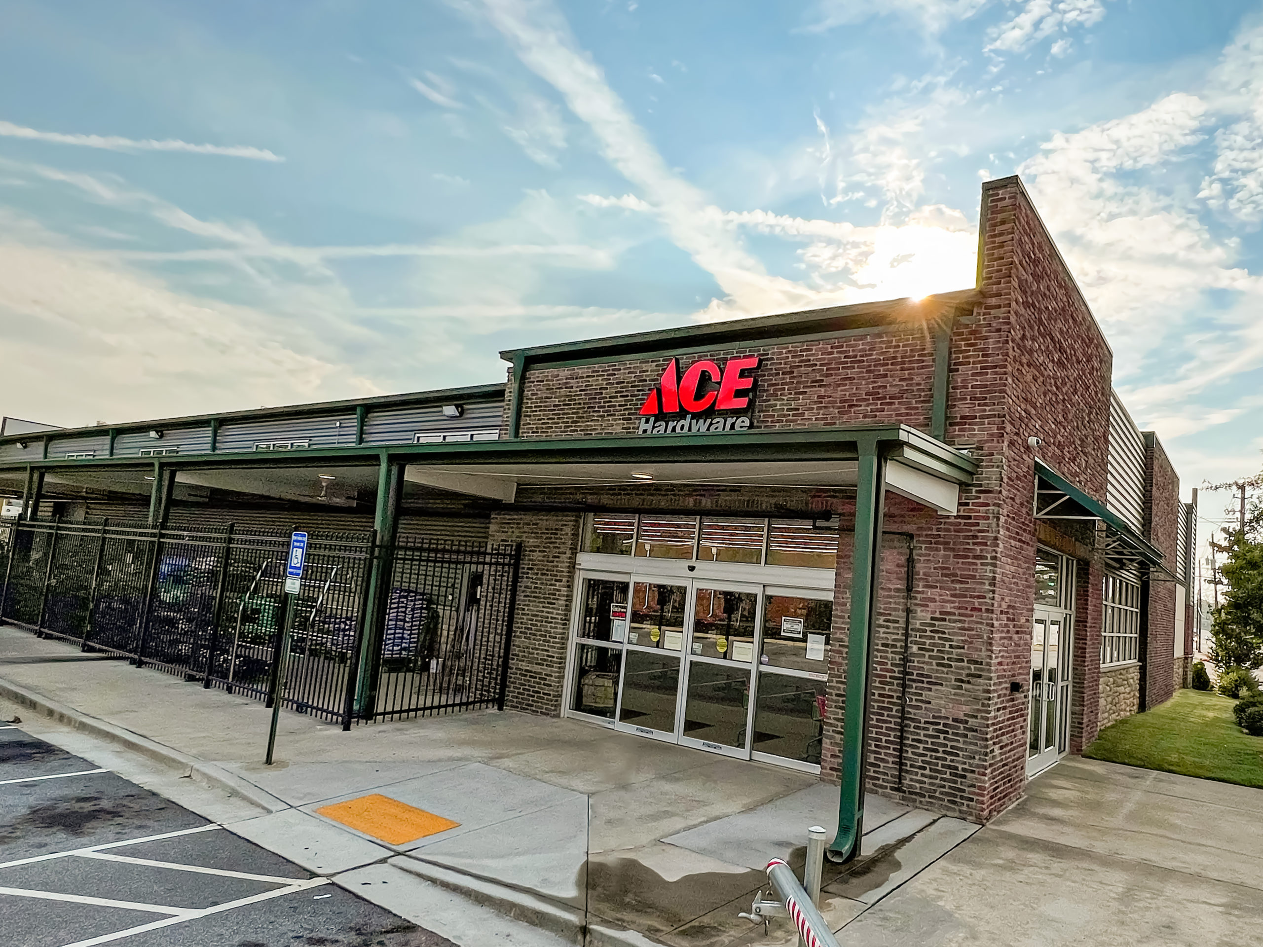
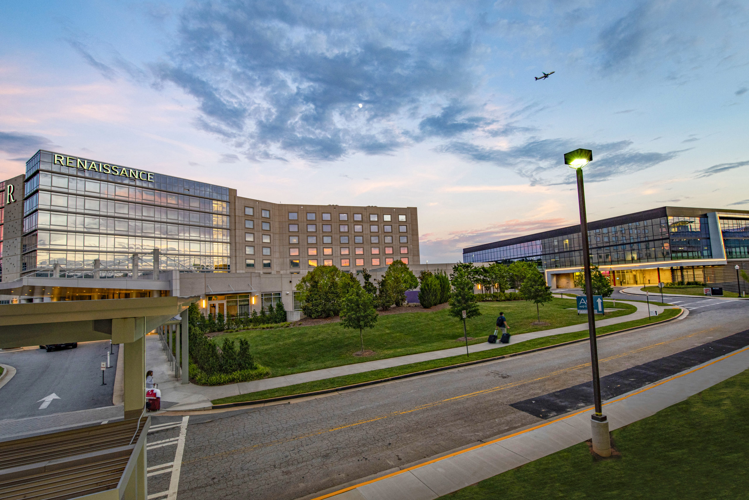
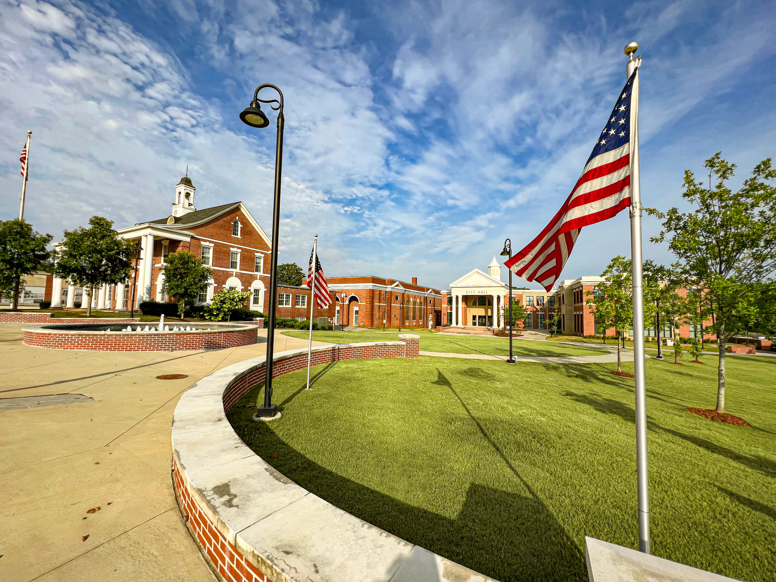
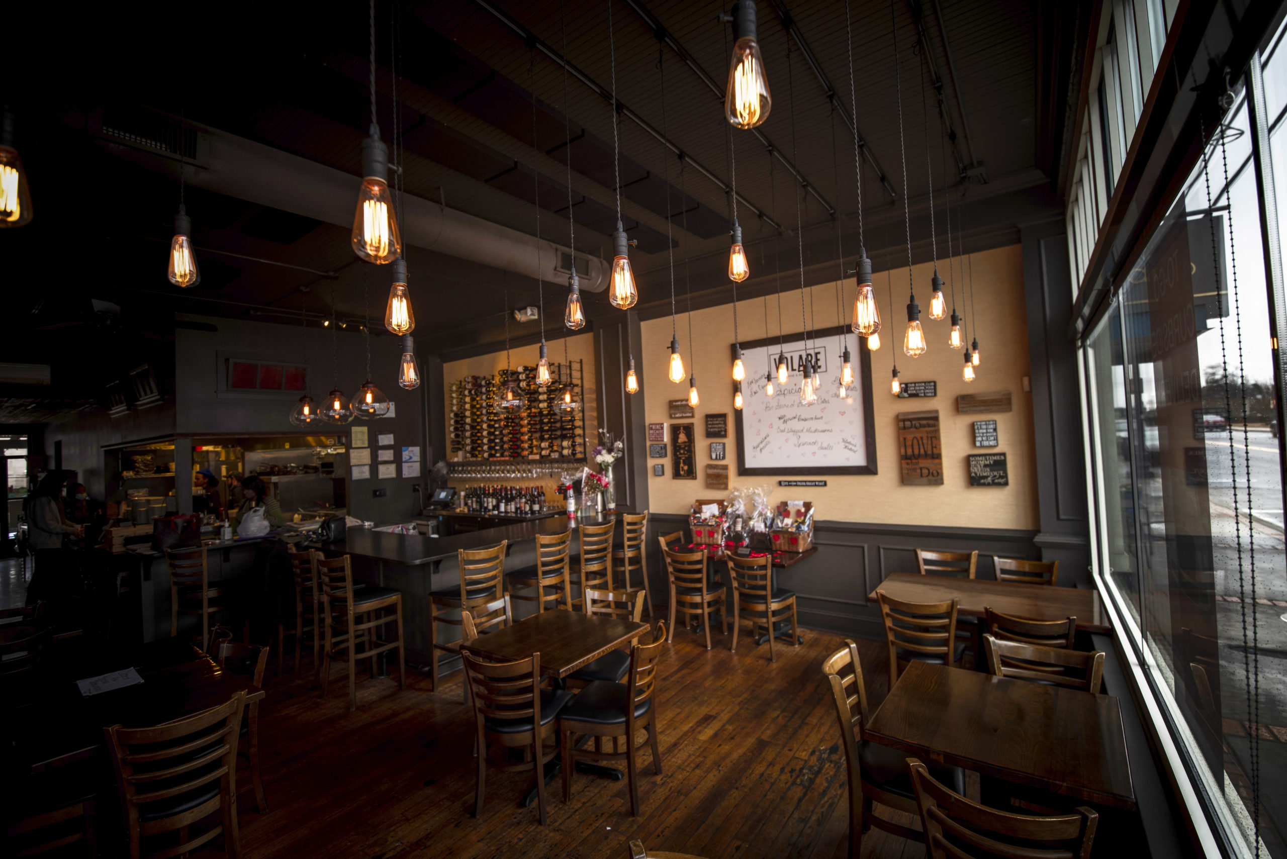
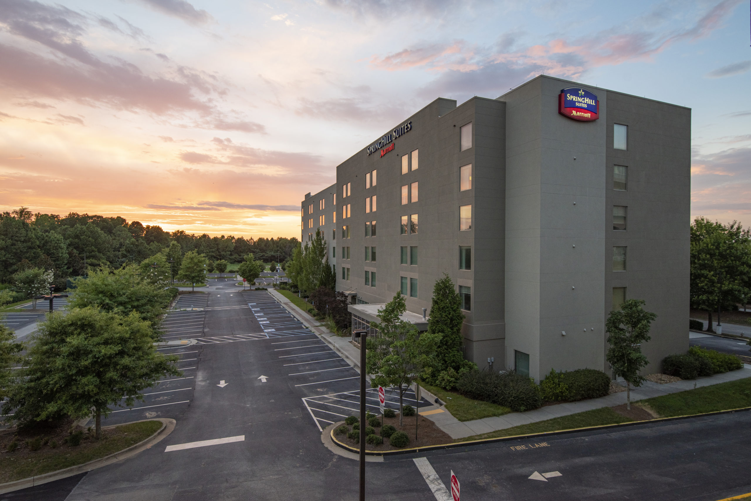
Architecture Photography
Having worked with several Convention & Visitors Bureaus through the years, Ethic® Creative Works knows there’s nothing more important than photography. From highlighting a city’s assets to creating killer advertising, Ethic is on the scene, snapping the shots we need to bring a community to life. If we can’t shoot it ourselves, we work with fantastic partners to ensure we get what we need every time. Here are few of our favorite architecture shots.


©2022 Ethic Inc. All rights reserved
MTB Atlanta
Ethic® Creative Works provides branding simplification, tagline development, and marketing as needed for one of the premiere non-profit Mountain Biking organizations in the Southeast. MTB Atlanta promotes, designs, develops, and builds most of the trails within the Metro Atlanta region.
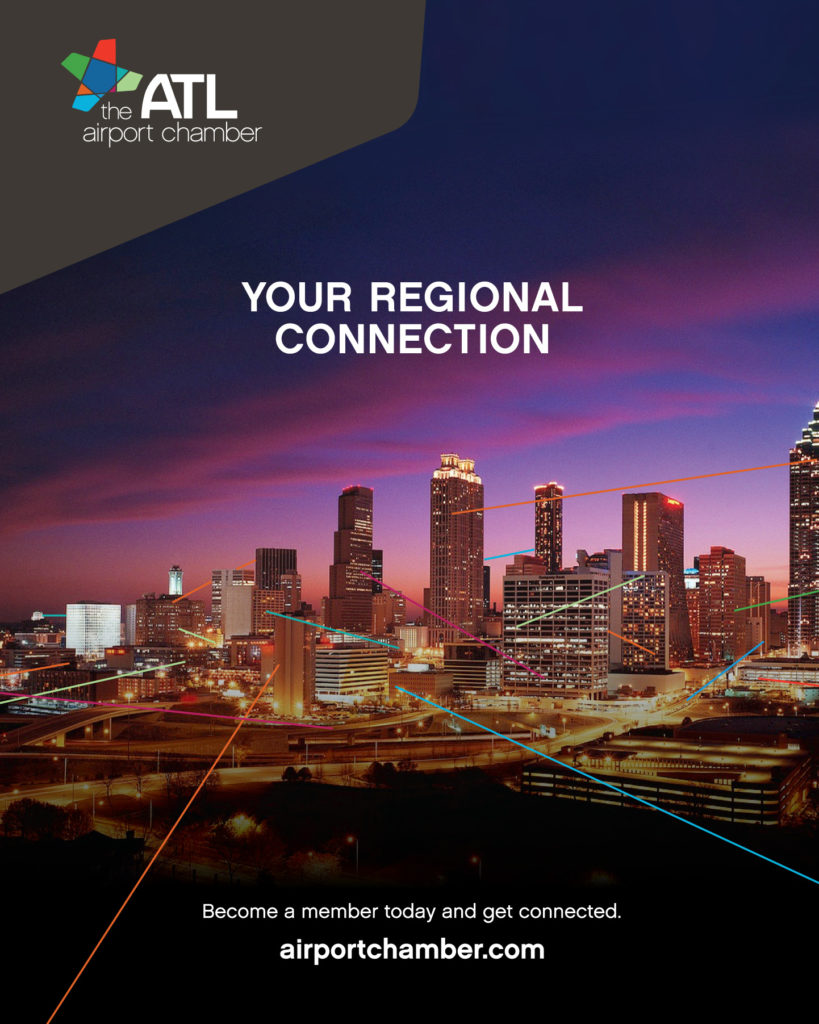
ATL Airport Chamber Ad
After rebranding the ATL Airport Chamber, Ethic developed this new straight-to-the-point ad campaign.
CDC’s Healthy Communities Program
Divisions at the CDC are not permitted to have their own logos, but they are allowed to create a graphic device to be used on their public-facing marketing materials. We designed an icon to represent the interplay of people and the community they live and work in, then paired it with the division’s mission statement to identify them with the market they serve.
East Point Commons
East Point Commons has been the city of East Point’s de facto gathering place for many years. From fireworks to marches, movies, music, and the arts, this strip of public land has always been the center of the community. When the time came to reimagine its image in preparation for long-awaited development of the space, Ethic used a series of similar but diverse geometric shapes to represent the people of East Point coming together. The vibrant, uplifting colors are a perfect fit for a bright and modern new East Point.
The City of Hapeville
For a modern city, Hapeville has some deep roots. So when Ethic® Creative Works redesigned their logo, we wanted to give them a cleaner look without sacrificing their unique attributes: the railroad tracks that run along the city’s main drag, the elevated footbridge that carries pedestrians across them, and the adjacent airport. The new logo incorporates all of these things, with a tidy geometric approach to hold them all together.
Member One Membership Eligibility
Member One Federal Credit Union tasked Ethic® Creative Works with the art direction, design, animation and final production of their latest informative explainer video. This particular video breaks down Membership Eligibility.
Other videos in the series include Membership Benefits and Mobile Deposit.
Member One Membership Benefits
Ethic® Creative Works provided art direction, design, and from-scratch animation of a series of informational explainer videos for Member One Federal Credit Union. This particular video focuses on Membership Benefits, going into some detail on exactly how a Credit Union works.
Other explainers in the series include Membership Eligibility and Mobile Deposit.