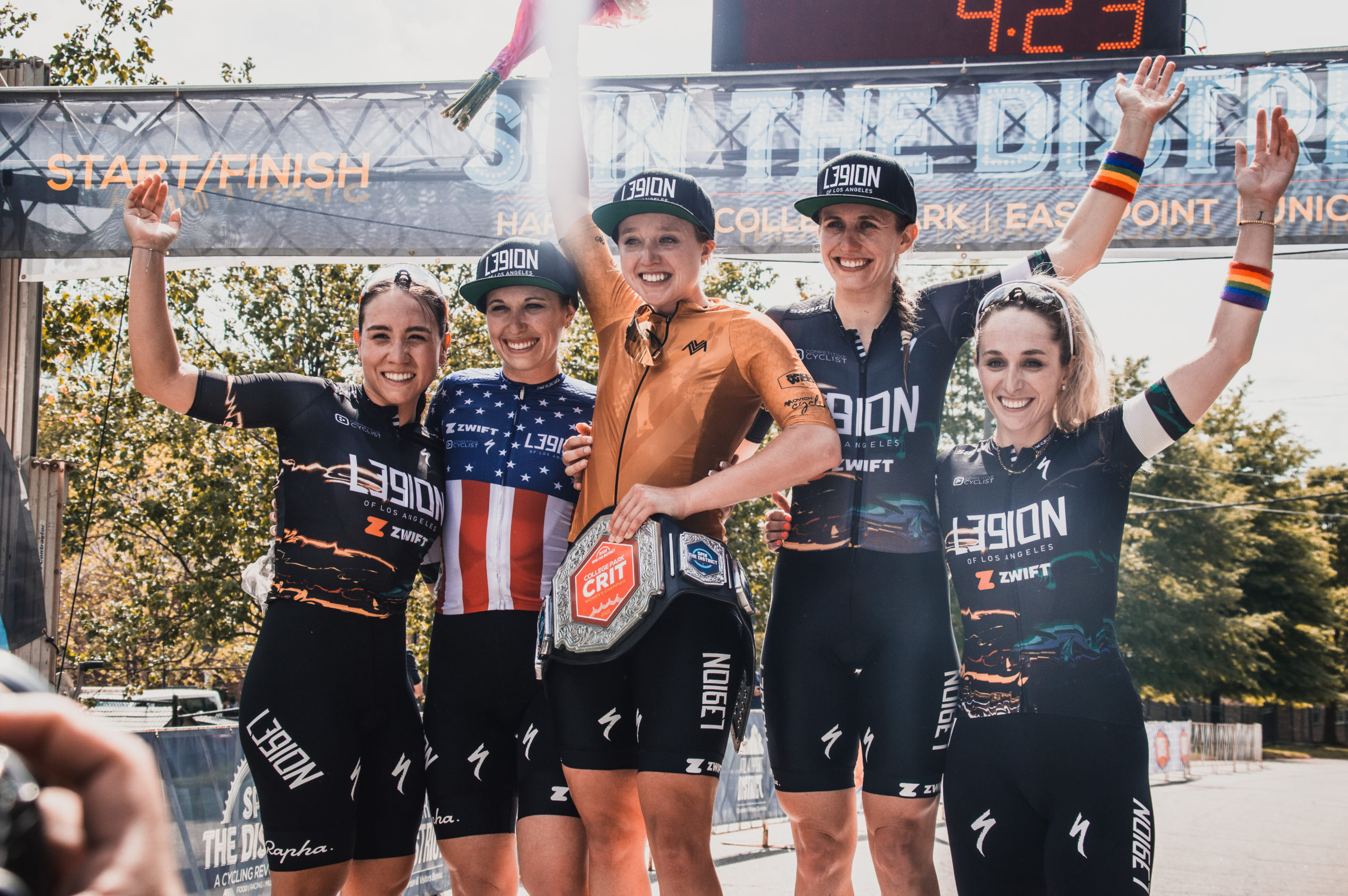
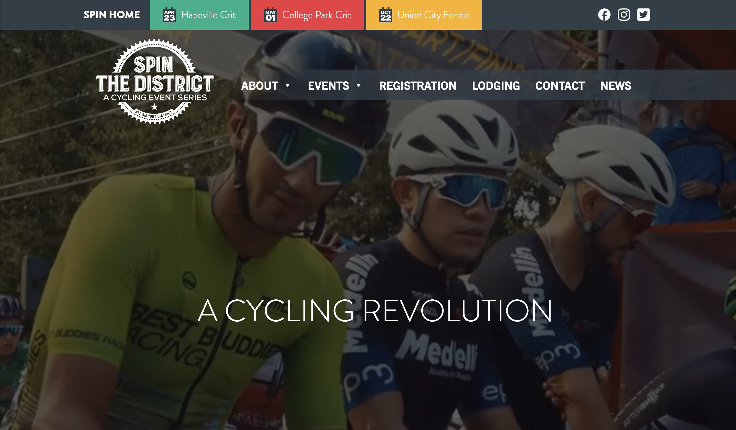
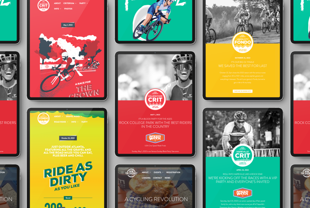
Spin the District, a local cycling event series that showcases multiple styles of cycling, has traditionally used the same design aesthetic across all four events, our main priority being to brand them as a single series. But for 2022, Ethic® Creative Works decided it was time to break free a bit and highlight each event’s individual personality.
Some things were non-negotiable. Each event had already committed to a dominant brand color, with the main Spin brand being predominantly navy. Color blocks have always been a major player in the Spin look, so it made sense to keep those, and the fonts are the fonts. So, with those details in mind, we created new custom illustrations with four distinct vibes to capture the feeling of each of these very different events.
The Hapeville Crit and College Park Crit are, naturally, the events that have the most in common. Their posters have a few extra shared elements, with both using their brand color as a solid backdrop behind a dynamic cycling illustration. Hapeville, however, gets a smooth-yet-caffeinated vector aesthetic, while College Park sees more of a hand-cut lino feel.
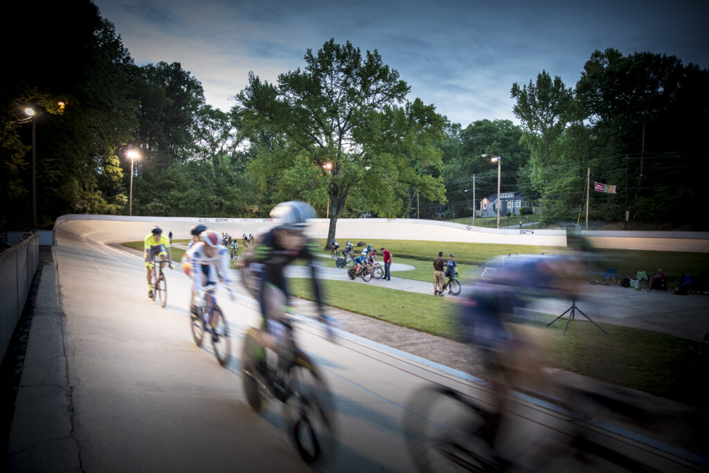
Meanwhile, the East Point Omni is an evening velodrome event with a disco theme. Because it’s all in one place and has the unique feeling of being temporarily separated from the real world, its cheeky poster lets the disco ball do double duty as a UFO.
Last but not least, the Union City Fondo is multiple events unto itself, with gravel rides and road rides occurring side-by-side. Its grittier, messier and somewhat more primitive illustrations are evocative of the day itself.
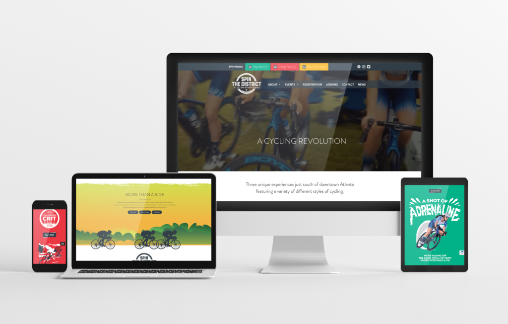
These poster illustrations were the starting point. From there, each new aesthetic was brought over to spinthedistrict.com, as well as being incorporated into all event-specific marketing materials and messaging.