
In 2006, Alcoa Employees and Community Credit Union, a longstanding Midwestern financial institution, needed to separate from the world’s third-largest aluminum producer. (Tale as old as time, right?) After settling on a new name and logo, the newly-christened Ascentra brought in the Ethic® Creative Works team to take over the development of their young brand, and we’ve been nurturing and helping it grow ever since.
GICC Ad Campaign
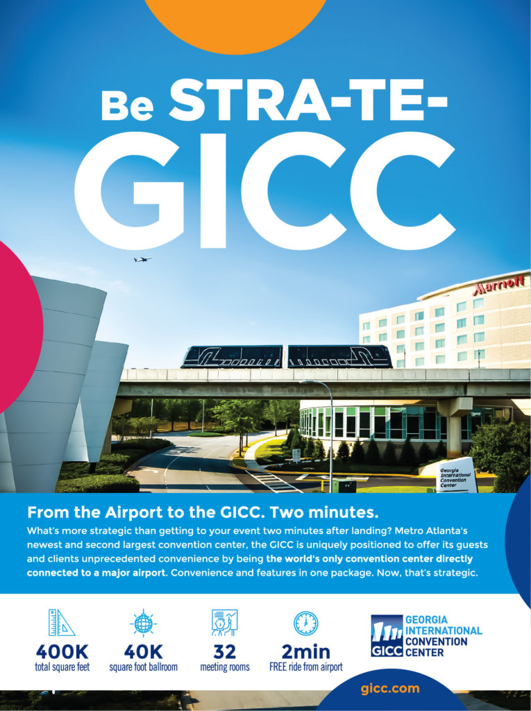
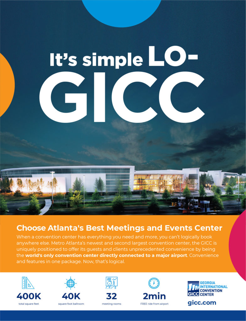
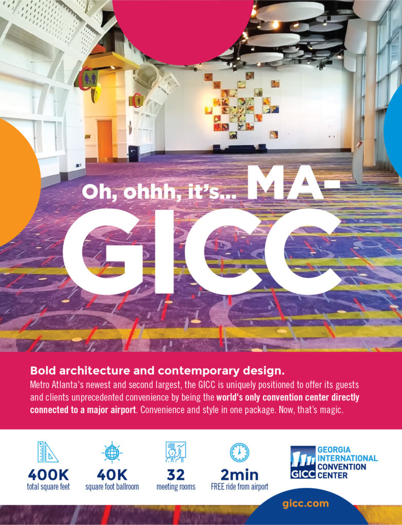
Ethic® Creative Works created this print campaign for Georgia’s second largest convention center, the Georgia International Convention Center (GICC), placing the facility’s acronym front and center. Each ad catches the reader’s attention with bright colors and a fun play on words—plus the occasional earworm.
Dream Empire
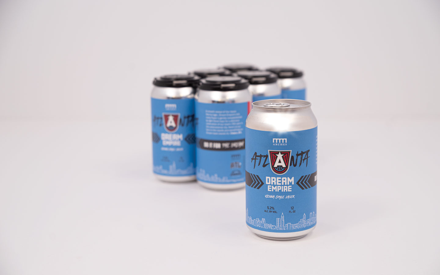
Ethic® Creative Works partnered with the Atlanta Dream and Arches Brewing to name, design, and develop the first official WNBA beer. With graphic colors and artistic-yet-classic line art, our design smoothly bridges the gap between the Arches brand and the Dream’s.
A smooth revival of the classic Vienna lager, Dream Empire’s rich, nutty flavor is gently complimented by light floral hops for a delicious celebration of our team’s 15th year in this phenomenal city. Here’s to our fans in the stands and everything our Dream team stands for. Cheers, ATL.
Ethic’s brewer’s notes
Spincouragement – Spin the District Social
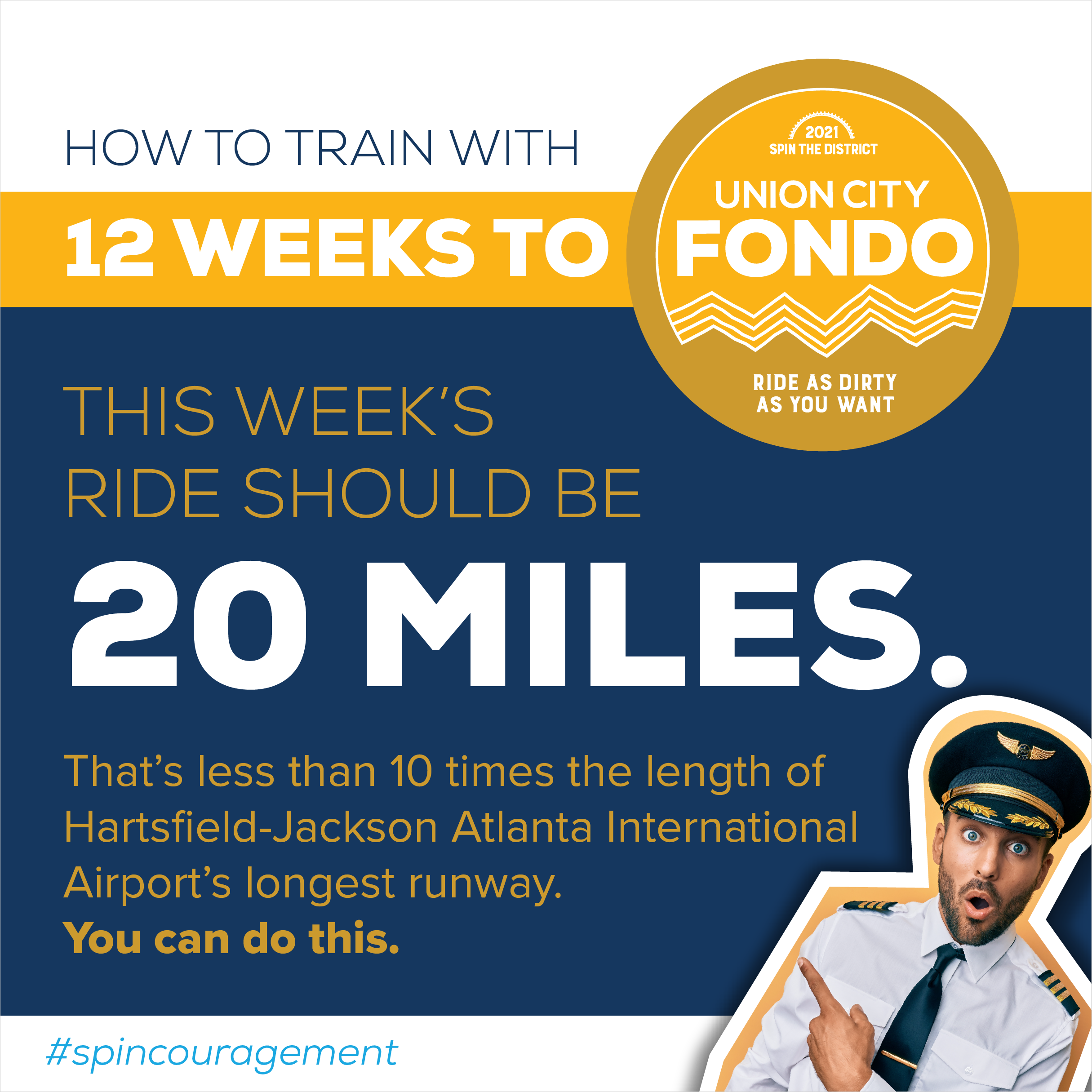
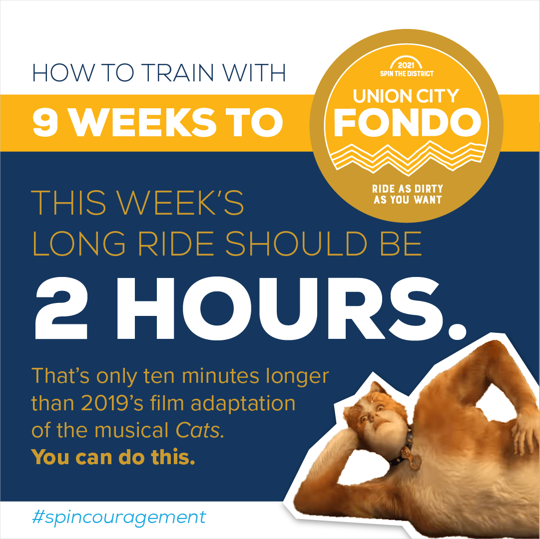
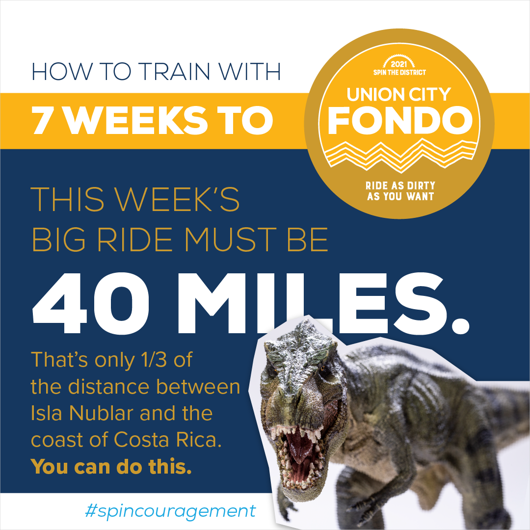
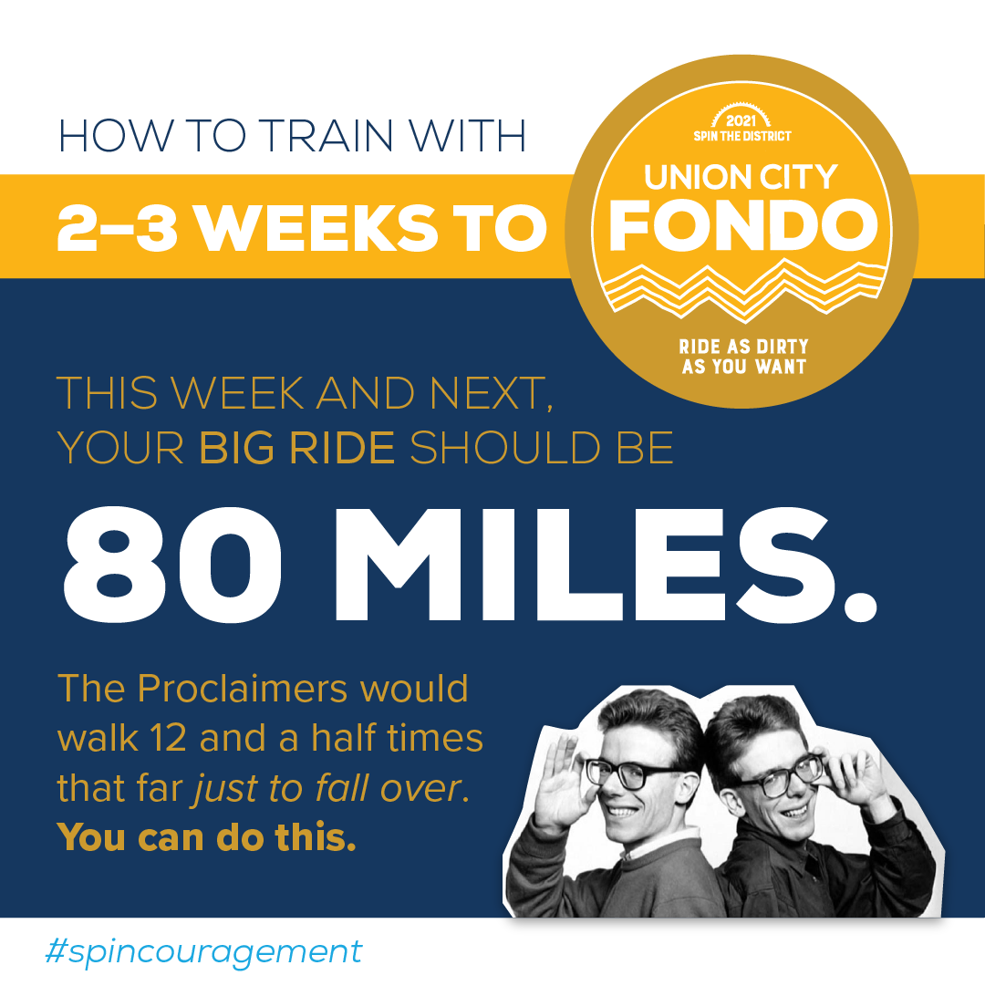
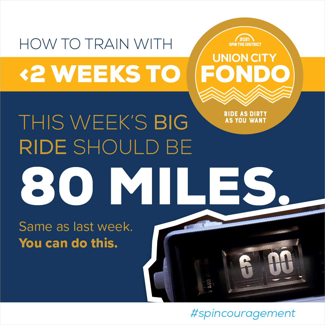
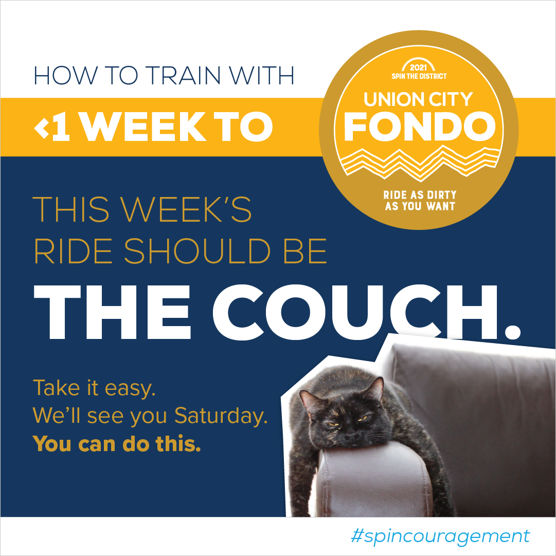
The trickiest part of getting attendees to register for a difficult cycling event is convincing them that they’re up to the challenge. Spin the District’s Union City Road Fondo & Gravel Grind includes several grueling rides, some of which are over 100 miles long and all of which are basically made of 1,000 hills. Naturally, a lot of first-time Fondo riders question whether they have what it takes to be successful. Will they have fun? Will they embarrass themselves? When marketing the event to new participants, it’s up to us to give them the confidence to come out and give it a shot.
In 2021, Ethic® Creative Works connected with potential riders on social media by jumping in to help guide their training. #Spincouragement was born. Each post pulled the appropriate conditioning time or distance from our training schedule, then contextualized it to emphasize achievability: two hours spent pedaling doesn’t feel nearly as long as two hours watching Cats; cycling 40 miles is nothing compared to a compy swimming 120 miles for a seaside snack; if true love can make you walk 500 miles—twice!—then what’s a quick 80 on a bike, really? You can do this.
Six West
Six West is a mixed use development in College Park, Georgia, on a site that has sat undeveloped for decades after being cleared to build a runway for Hartsfield-Jackson Atlanta International Airport—a project long since abandoned.
The plot’s working title, “Airport City,” drastically understated the area’s character and history. So when Ethic® Creative Works was tapped to name and brand the new development, we saw it as an opportunity to influence the narrative of the city and the Southside.
Naming
We named it Six West because we believe it’s proud of what and where it is: the tract of land just west of downtown College Park, a bit west of the airport, occupying the west side of the Southside. With the development of this land into a new concept that will shape the growth and prosperity of the area, College Park engages in a modern, peaceful westward expansion of hope and optimism. The “six” alludes to the six roads that run through it, connecting the development to downtown and beyond. (It’s also a wink to the sixth runway and College Park’s resilience in the face of encroaching interests.)
These six roads, named for five Ivy League colleges and John Wesley, are an essential element of College Park’s narrative. By referencing the area’s connections both to the cities around it and to the history on which we now build, we memorialize the site’s past—while looking to the development itself for the future.
Logo
The logo we designed is a literal icon, proclaiming the numeral 6 loud and clear, comprised of six lines—or streets—all pointing west. We used a mix of sans-serif and serif fonts for maximum readability and gave it a strong, contemporary magenta to help it stand out from surrounding properties.
ATL Airport District Brochure
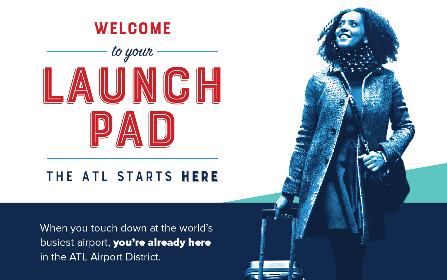
Anyone who’s stopped in a visitor center and picked up a bland, info-packed brochure has probably shared the disappointing experience of painstakingly selecting a restaurant from an exhaustive list, studying the map, and making their way across town on unfamiliar streets—only to find that their destination has shut down or moved or is no longer serving lunch on Sundays. This is an unfortunate pitfall of traditional destination marketing: the hotels and businesses in any given area typically experience changes far more frequently than brochures can realistically be revised, reprinted and replaced.
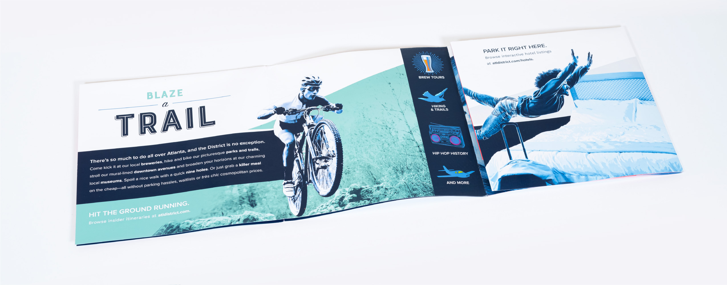
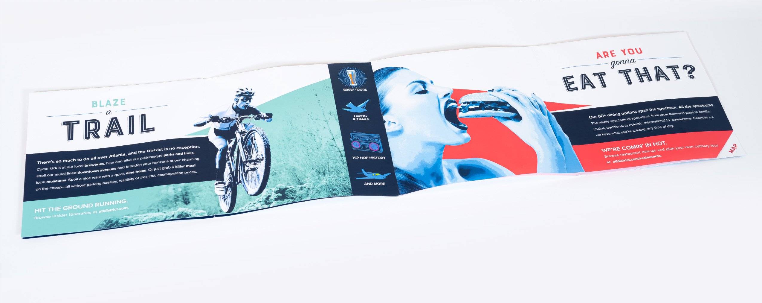
Early on in our collaboration with the ATL Airport District Convention & Visitors Bureau, Ethic® Creative Works made the pronouncement that the District need not fall victim to that issue in the digital age. Instead, we put together a heavily branded gatefold brochure that hits the area’s highlights: great hotels, outdoor activities, dining, and proximity to downtown and all of Metro Atlanta. Each is accompanied by bold, beautiful imagery, a short, sweet intro paragraph, and a URL where visitors can find up-to-date business and venue listings. No ghost listings here!
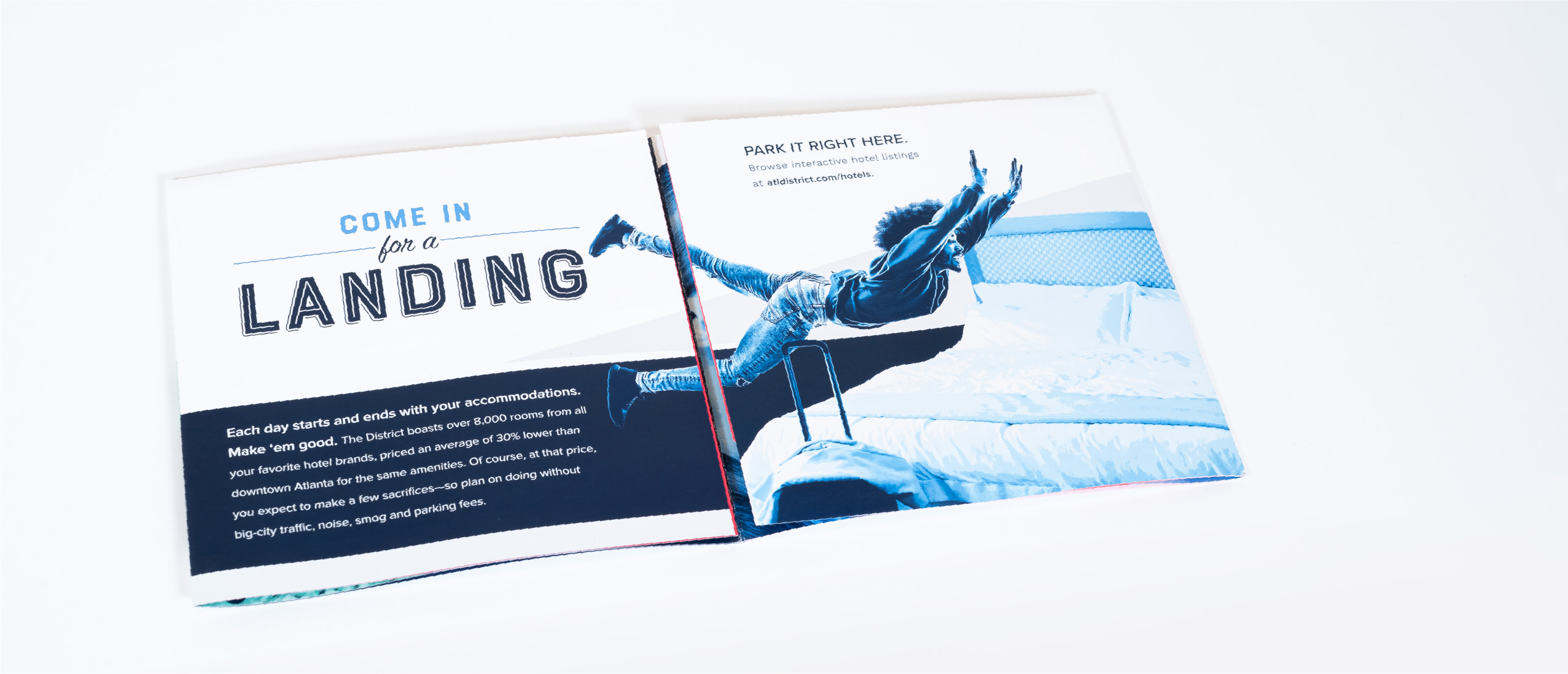
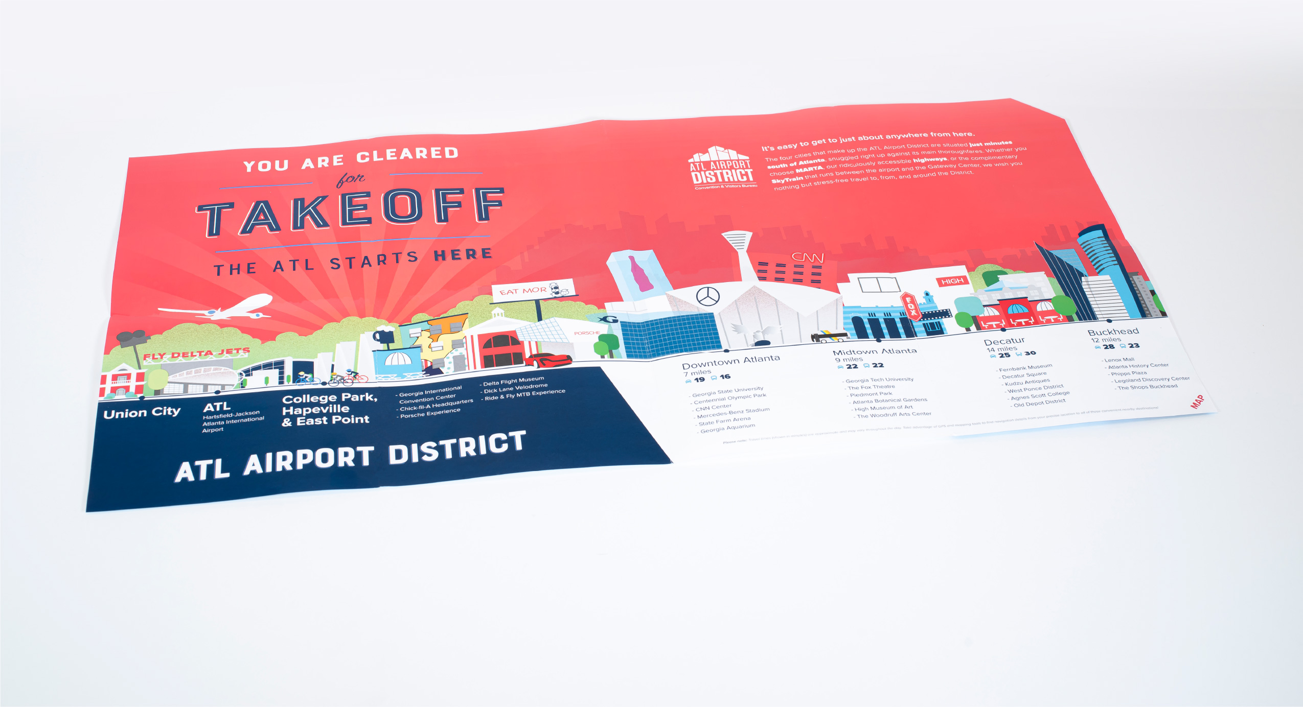
When the brochure is fully opened, its centerfold poster’s display-worthy illustration doubles as a handy-dandy references to Metro Atlanta’s nearest neighborhoods, listing some of their key attractions as well as travel times from the District by highway and transit. This gives the casual visitor an at-a-glance reminder of where they are in relation to everything they might like to do during their stay—and a reminder that the particulars are at their fingertips when they visit the website.
Gateway Center Arena website
Bear with us for a moment, or skip the next two paragraphs, because we’re about to hit you with some complicated info—the kind of info that would better be communicated via a thoughtfully-designed website.
Across the street (okay, interstate highway) from Hartsfield-Jackson Atlanta International Airport is the Gateway Center Campus, home to the Georgia International Convention Center and Gateway Center Arena. The buildings are separate, but functionally they’re under the same umbrella, along with CulinAero by Proof of the Pudding, the official caterer for both.
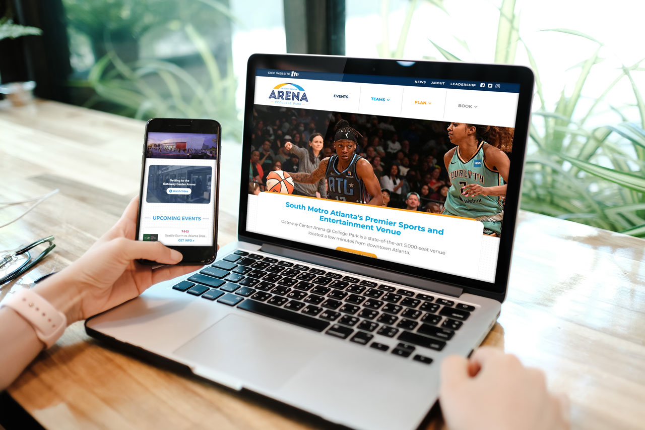
The Gateway Center Arena is the permanent home of three local sports teams: the Atlanta Dream (WNBA), the College Park Skyhawks (NBA G League), and LOVB Atlanta (professional volleyball). Fans need to be able to check schedules and plan accommodations from the site, so events are listed prominently on the home page. The Arena is also available for meetings and events, so there’s also handy information for planners and event attendees.
When it came to uniting each of these three brands, Ethic® Creative Works designed a near-seamless web experience. One site’s navigation flows into the next, with standardized layouts presented in each brand’s individual colors. A few carefully customized elements work to make each site feel unique while keeping them all closely connected. Ethic built the sites on the WordPress platform, making it easy for the Arena team to keep event listings, photos and information up to date.
The Member One Community
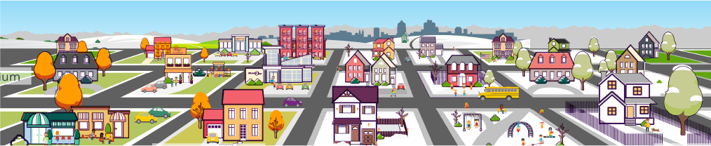
Although Member One Federal Credit Union has grown to a healthy size, it is still first and foremost a part of its Virginia community. To help keep video messaging centered on this truth, Ethic® Creative Works has developed the Member One community, an animated town where everyday neighbors’ lives are improved by cooperation with one another—and by the products and services offered by Member One.
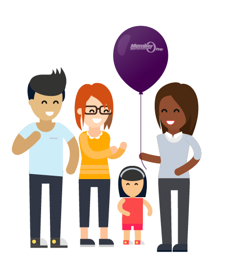
The community, which today includes high, medium and low density housing, a school, a park, a hospital, a few shops and a Member One retail location, has evolved over time as all communities do.
Its characters live, work and play against this backdrop: an ice cream man rolls down the street with his dog, young professionals plug away at their phones and laptops on park benches and scooters, friends pause during a jog to enjoy street magic or grab a bite at the corner sidewalk cafe. Kids hop on and off of school buses and gather in treehouses. Families buy homes, homeowners renovate, and neighborhood groups practice yoga in the park. Member One is part of it all, sometimes literally (guess what mobile app those young professionals are using!) or simply as a reminder that Member One is not only staffed by local community members, but owned by its members as well.
Our early community TV spots kept the camera at a distance, as in the community’s debut, below. Over time, we’ve pushed closer to the lives of our characters, making them more expressive and allowing them to bring the community itself to life as it continues to provide the thread that connects them.

Here, we’ve reimagined our first home buyers from a new perspective, illustrating how they might look in today’s updated community aesthetic.
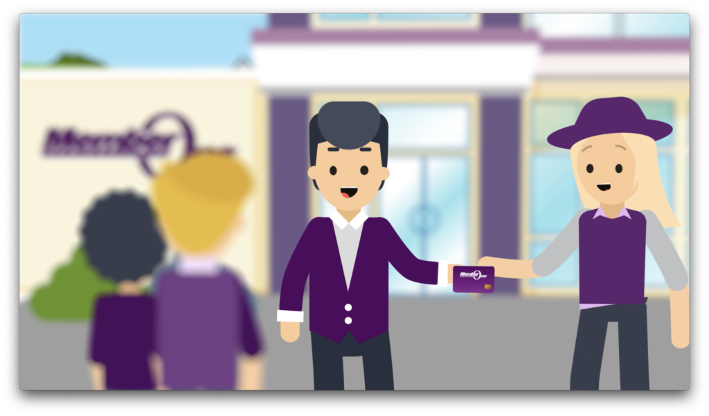
Member One itself is often seen in the Member One community, of course. That sleek modern architecture is a great background for many scenes, like this Checking ad.
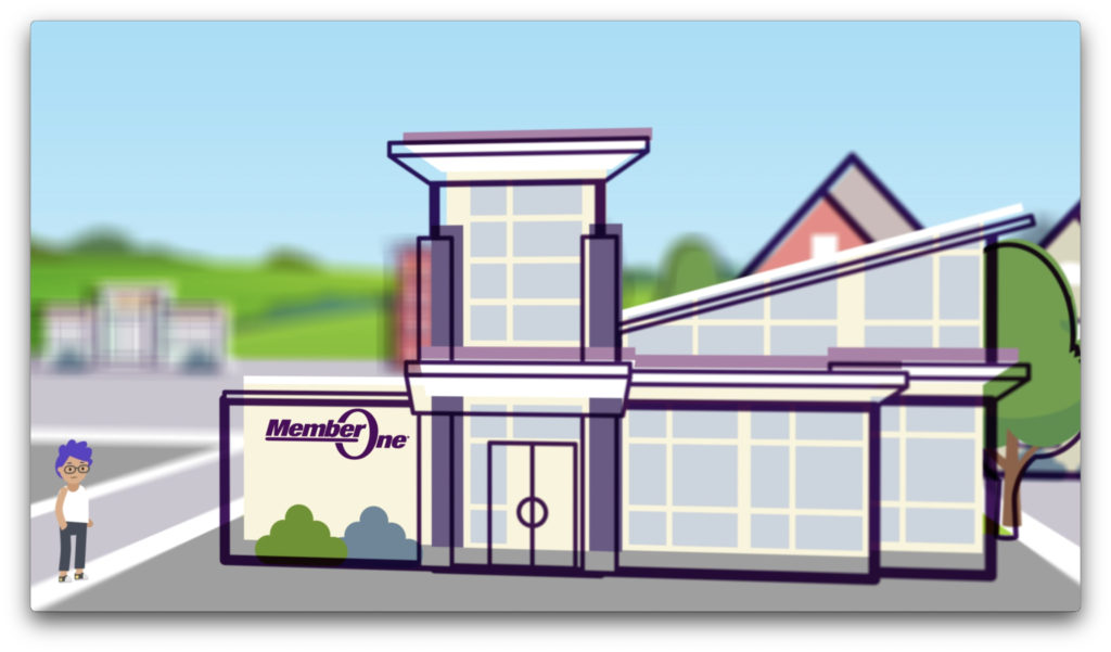
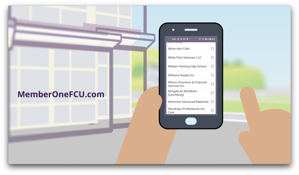
The consistent use of the flat animation style and the neighborhood itself have contributed to increased brand recognition within the credit union’s local market. This also provides a convenient animation framework that allows us to create explainers and other videos in short order as needed.
TripSource Website Development
When BCD Travel needed a new website for their TripSource brand, they turned to Ethic® Creative Works to build it. The site is a complete top-to-bottom redesign from their previous look, with scroll-activated animations to help explain key features of the TripSource platform. The site was a complex development undertaking but we were up to the task and delivered it on a tight schedule to be showcased at an upcoming conference.
Crawford Brew Works Swag
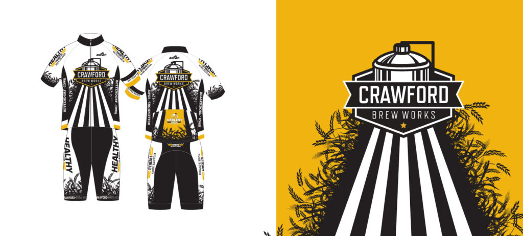
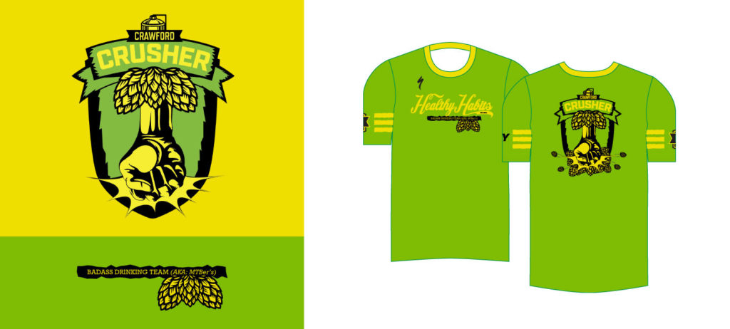
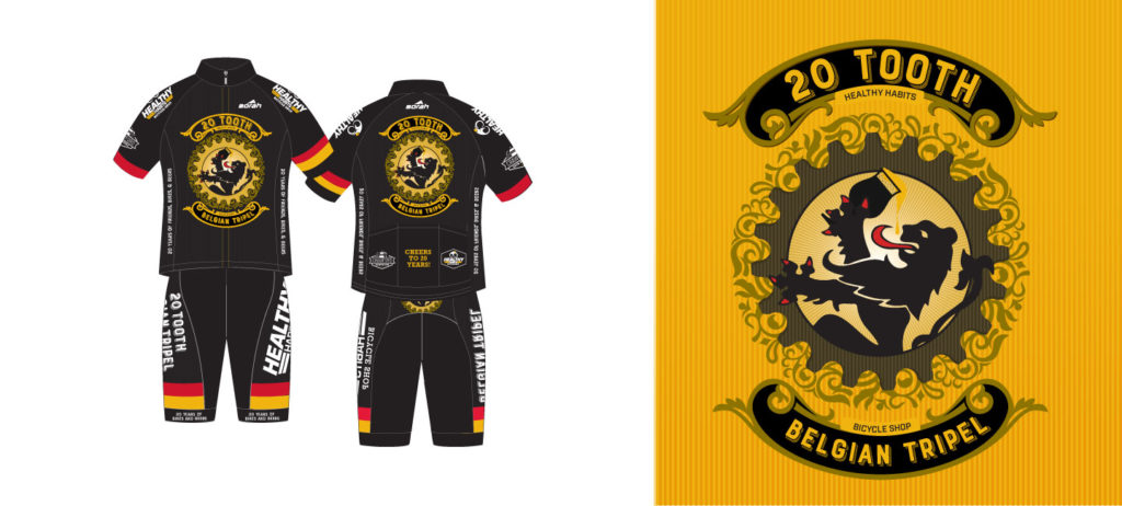
Just next door to our friends at Healthy Habits bike shop is Crawford Brew Works. At Ethic® Creative Works, we like to think of beer as good carbs, so we’re all about helping out breweries when we get the chance. If it’s bike-related, that’s a bonus. Here are a few of the cycling jerseys we’ve designed for the cool kids at Crawford over the years—including some collabs with Healthy Habits.
Ascentra Credit Union: Fran & Friends
A mascot or illustrated spokesperson can be an effective way to help your audience build connections with your brand, both visually and emotionally. In the case of Ascentra Credit Union, this approach also allows us to bring brand unity to the client’s especially wide variety of offers and benefits. Creatively, these characters are also a lot of fun to work with, because they give us a base with which to illustrate all kinds of situations. Here’s how Ethic® Creative Works took Ascentra’s mascot game to the next level.
GICC.com
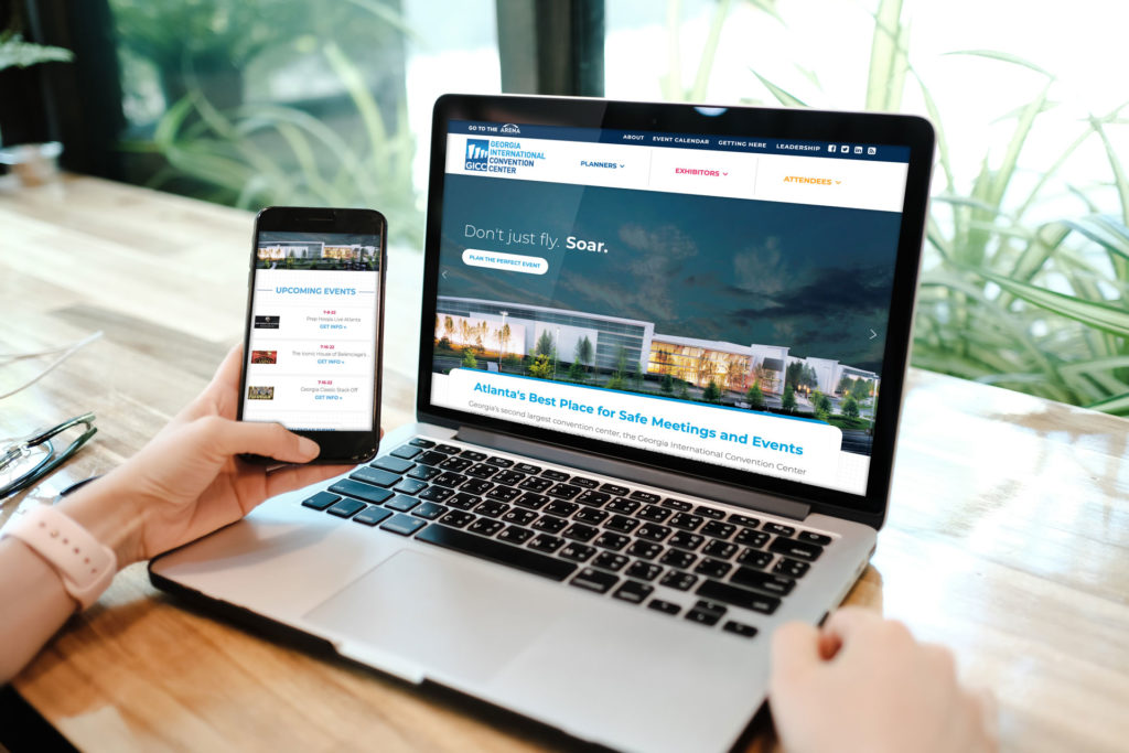
Across the street (okay, interstate highway) from Hartsfield-Jackson Atlanta International Airport is the Gateway Center, home to the Georgia International Convention Center and Gateway Center Arena. The buildings are separate, but functionally they’re under the same umbrella, along with CulinAero, the official caterer for both.
The GICC is the second largest convention center in the state of Georgia. As such, professional meeting and event planners make up a significant proportion of its target audience. We’ve placed all the key tools for event planning front and center for them so they can get right down to business.
When it came to uniting each of these three brands, Ethic designed a near-seamless web experience. One site’s navigation flows into the next, with standardized layouts presented in each brand’s individual colors. A few carefully customized elements work to make each site feel unique while keeping them all closely connected. Ethic built the sites on the WordPress platform, making it easy for the convention center team to keep the facility’s information and schedule up to date.