The Member One Community

Although Member One Federal Credit Union has grown to a healthy size, it is still first and foremost a part of its Virginia community. To help keep video messaging centered on this truth, Ethic has developed the Member One community, an animated town where everyday neighbors’ lives are improved by cooperation with one another—and by the products and services offered by Member One.

A preliminary drawing of the family from our Mortgage television commercial.

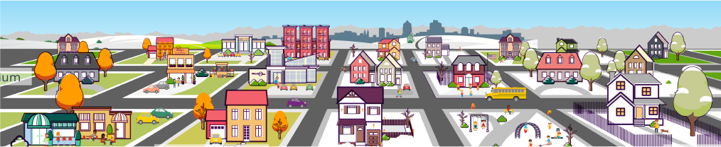
The community, which today includes high, medium and low density housing, a school, a park, a hospital, a few shops and a Member One retail location, has evolved over time as all communities do.

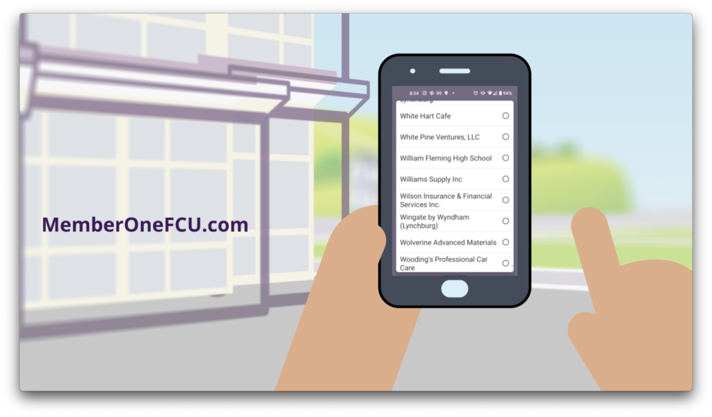
Its characters live, work and play against this backdrop: an ice cream man rolls down the street with his dog, young professionals plug away at their phones and laptops on park benches and scooters, friends pause during a jog to enjoy street magic or grab a bite at the corner sidewalk cafe. Kids hop on and off of school buses and gather in treehouses. Families buy homes, homeowners renovate, and neighborhood groups practice yoga in the park. Member One is part of it all, sometimes literally (guess what mobile app those young professionals are using!) or simply as a reminder that Member One is not only staffed by local community members, but owned by its members as well.

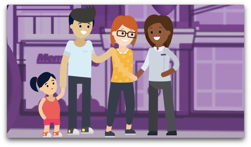
Our early community TV spots kept the camera at a distance, as in the community’s debut, below. Over time, we’ve pushed closer to the lives of our characters, making them more expressive and allowing them to bring the community itself to life as it continues to provide the thread that connects them.

Here, we’ve reimagined our first home buyers from a new perspective, illustrating how they might look in today’s updated community aesthetic.

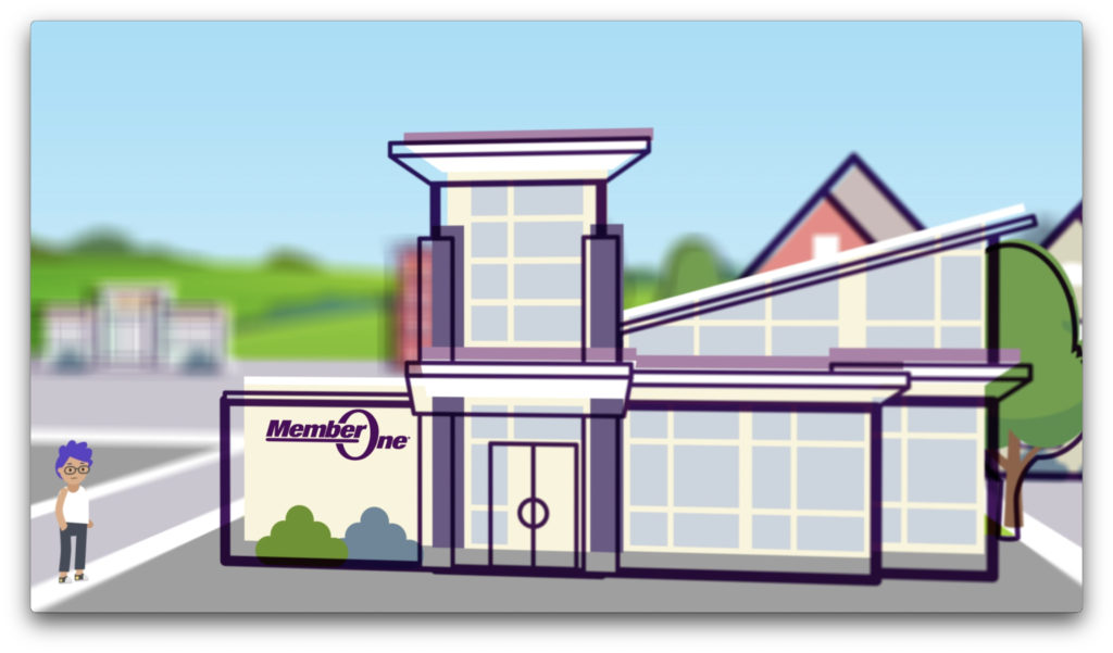
Member One itself is often seen in the Member One community, of course. That sleek modern architecture is a great background for many scenes, like this Checking ad.

Another example of Member One in the Member One community, this explainer video positions its main character awkwardly beside the branch for comedic effect.
Later in the same video, we shift to a first-person perspective as the character uses the Member One mobile app. The building remains visible.

The consistent use of the flat animation style and the neighborhood itself have contributed to increased brand recognition within the credit union’s local market. This also provides a convenient animation framework that allows us to create explainers and other videos in short order as needed.

Ascentra – sHELOC TV Spot

When Ascentra Credit Union’s animated mascot Fran needed a break from the endless demands of parenthood and home ownership, Ascentra’s HELOC (home equity line of credit) came to her rescue with a new pool. “Fran is dreaming of lazy days with her favorite floaty, because sHELOC’d it and dropped it on a swimming pool!”

Part of a small series of TV spots featuring a variety of purchases, this thirty-second HELOC commercial was written and created for broadcast, but is versatile enough to be used again online as OTT content.

The sHELOC ad campaign extended beyond video, ultimately showing off Fran’s new pool across print advertising, digital/online banner ads, social media posts, and out-of-home placements like billboards and in-branch plasma screens.

But where did “sHELOC” come from? HELOC products are common across financial institutions, which makes differentiation a challenge in a crowded market. Playing with the phonetic pronunciation of the acronym—he-lock—and attaching it to the idea of “locking in” a lending agreement brought a memorable playfulness to an otherwise dry concept. And of course, once we personalized it for Fran, this naturally became the she-lock that she’d use for her pool, her “she shed” and anything else her animated heart desired.

ATL Airport District digital marketing

Digital marketing and online content each play a big part in the long and successful marketing partnership shared by Ethic and the ATL Airport District. From simple banner ads to HTML5 embeds, OTT video, and social media headers and templates, we do all we can to ensure the District’s online presence is complete, compelling, consistent, and in keeping with the times.

Video content for the District needs to check several boxes, from catching the interest of the casual social media scroller to dispelling popular misconceptions about the Southside—all while of course marketing the District as the fantastic tourism and meetings destination that it is. The above video was created as a bombastic reintroduction to the tourism market during late fall of 2020, when U.S. travel was reopening after widespread pandemic panic.

Several of ATL Airport District's digital ads

As an ongoing digital echo of its main brand and current campaign, the District’s banner ads feature the same bold brand color usage and punny transportation-forward headlines. While the look and messaging evolve alongside our broader traditional advertising campaigns, they are always distinctly the District.

Dream Empire

Atlanta Dream Lager

Ethic partnered with the Atlanta Dream and Arches Brewing to name, design, and develop the first official WNBA beer. With graphic colors and artistic-yet-classic line art, our design smoothly bridges the gap between the Arches brand and the Dream’s.

A smooth revival of the classic Vienna lager, Dream Empire’s rich, nutty flavor is gently complimented by light floral hops for a delicious celebration of our team’s 15th year in this phenomenal city. Here’s to our fans in the stands and everything our Dream team stands for. Cheers, ATL.

Ethic’s brewer’s notes

Spincouragement – Spin the District Social

The trickiest part of getting attendees to register for a difficult cycling event is convincing them that they’re up to the challenge. Spin the District’s Union City Road Fondo & Gravel Grind includes several grueling rides, some of which are over 100 miles long and all of which are basically made of 1,000 hills. Naturally, a lot of first-time Fondo riders question whether they have what it takes to be successful. Will they have fun? Will they embarrass themselves? When marketing the event to new participants, it’s up to us to give them the confidence to come out and give it a shot.

In 2021, we connected with potential riders on social media by jumping in to help guide their training. #Spincouragement was born. Each post pulled the appropriate conditioning time or distance from our training schedule, then contextualized it to emphasize achievability: two hours spent pedaling doesn’t feel nearly as long as two hours watching Cats; cycling 40 miles is nothing compared to a compy swimming 120 miles for a seaside snack; if true love can make you walk 500 miles—twice!—then what’s a quick 80 on a bike, really? You can do this.

Six West

Six West is a mixed use development in College Park, Georgia, on a site that has sat undeveloped for decades after being cleared to build a runway for Hartsfield-Jackson Atlanta International Airport—a project long since abandoned.


The plot’s working title, “Airport City,” drastically understated the area’s character and history. So when Ethic was tapped to name and brand the new development, we saw it as an opportunity to influence the narrative of the city and the Southside.

Naming
We named it Six West because we believe it’s proud of what and where it is: the tract of land just west of downtown College Park, a bit west of the airport, occupying the west side of the Southside. With the development of this land into a new concept that will shape the growth and prosperity of the area, College Park engages in a modern, peaceful westward expansion of hope and optimism. The “six” alludes to the six roads that run through it, connecting the development to downtown and beyond. (It’s also a wink to the sixth runway and College Park’s resilience in the face of encroaching interests.)


These six roads, named for five Ivy League colleges and John Wesley, are an essential element of College Park’s narrative. By referencing the area’s connections both to the cities around it and to the history on which we now build, we memorialize the site’s past—while looking to the development itself for the future.

Logo
The logo we designed is a literal icon, proclaiming the numeral 6 loud and clear, comprised of six lines—or streets—all pointing west. We used a mix of sans-serif and serif fonts for maximum readability and gave it a strong, contemporary magenta to help it stand out from surrounding properties.

Visit Sandy Springs Ad Campaign

Visit Sandy Springs Family Bonding

Play Outside Atlanta

Sandy Springs offers the convenience of an Atlanta-adjacent suburb—but Atlanta has lots of suburbs.

Lucky for Sandy Springs, this one is set apart by luxurious outdoor recreation that’s rarely found in a

metropolitan setting. Ethic’s “Play Outside Atlanta” campaign spotlights this key strength with evocative

visuals that help newcomers feel the joy of visiting a destination worth texting home about.

Visit Sandy Springs Morgan Falls Ad

Gateway Center Arena website

Across the street (okay, interstate highway) from Hartsfield-Jackson Atlanta International Airport is the Gateway Center, home to the Georgia International Convention Center and Gateway Center Arena. The buildings are separate, but functionally they’re under the same umbrella, along with CulinAero, the official caterer for both.

The Gateway Center Arena is the permanent home of two local sports teams, the Atlanta Dream (WNBA) and the College Park Skyhawks (NBA G League). Fans need to be able to check schedules and plan accommodations from the site, so events are listed prominently on the home page. The Arena is also available for meetings and events, so there’s also handy information for planners and event attendees.

When it came to uniting each of these three brands, Ethic designed a near-seamless web experience. One site’s navigation flows into the next, with standardized layouts presented in each brand’s individual colors. A few carefully customized elements work to make each site feel unique while keeping them all closely connected. Ethic built the sites on the WordPress platform, making it easy for the Arena team to keep event listings, photos and information up to date.

TripSource Website Development

When BCD Travel needed a new website for their TripSource brand, they turned to us to build it. The site is a complete top-to-bottom redesign from their previous look, with scroll-activated animations to help explain key features of the TripSource platform. The site was a complex development undertaking but we were up to the task and delivered it on a tight schedule to be showcased at an upcoming conference.

Crawford Brew Works Swag

Just next door to our friends at Healthy Habits bike shop is Crawford Brew Works. We like to think of beer as good carbs, so we’re all about helping out breweries when we get the chance. If it’s bike-related, that’s a bonus. Here are a few of the cycling jerseys we’ve designed for the cool kids at Crawford over the years—including some collabs with Healthy Habits.

Crawford Brew Works cycling jersey

Crusher IPA Mountain Bike Jersey
Crawford Brew Works and Healthy Habits 20th anniversary Belgian Tripel Jersey