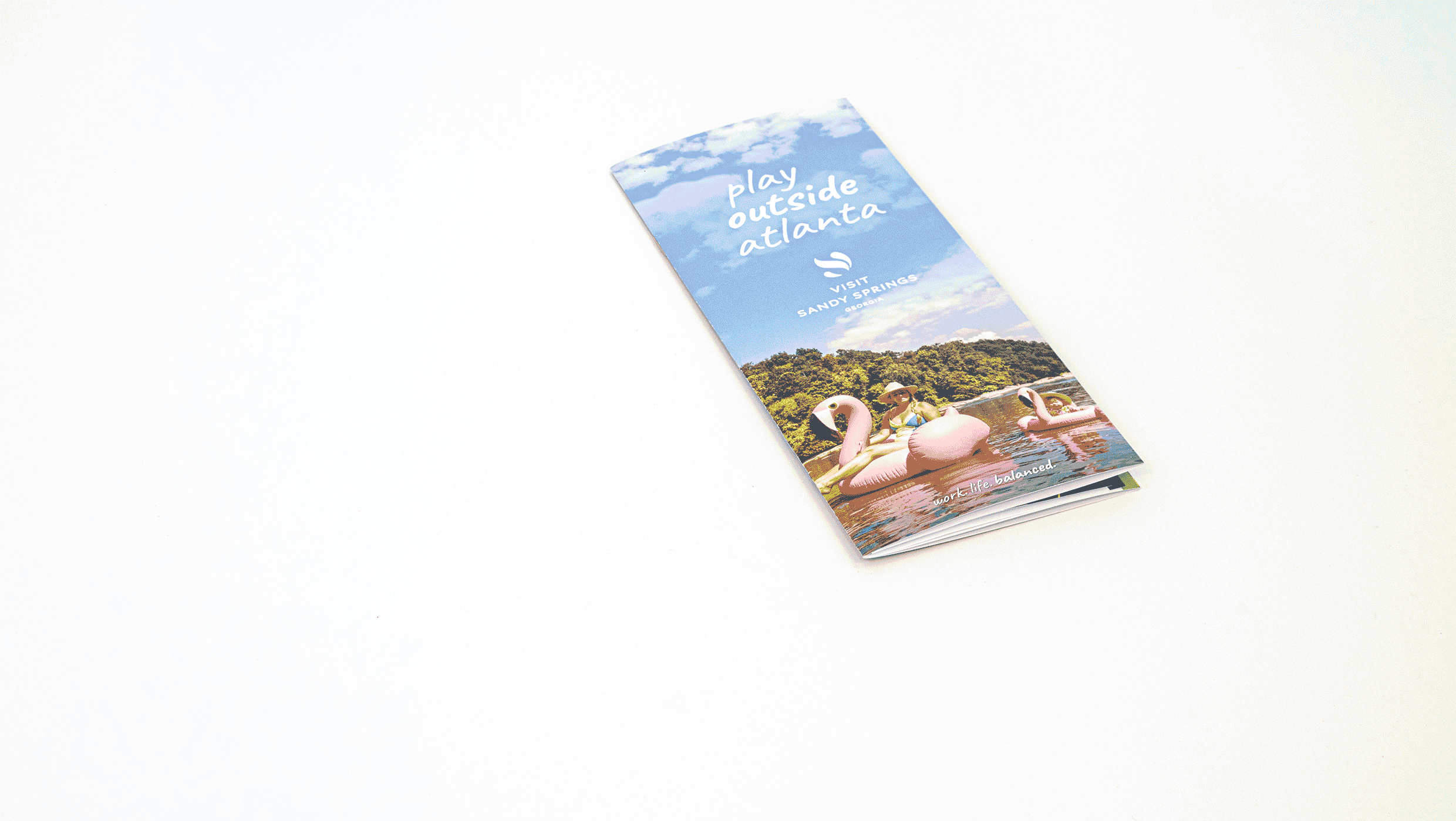
CDC’s Healthy Communities Program

Divisions at the CDC are not permitted to have their own logos, but they are allowed to create a graphic device to be used on their public-facing marketing materials. We designed an icon to represent the interplay of people and the community they live and work in, then paired it with the division’s mission statement to identify them with the market they serve.

East Point Commons

East Point Commons has been the city of East Point’s de facto gathering place for many years. From fireworks to marches, movies, music, and the arts, this strip of public land has always been the center of the community. When the time came to reimagine its image in preparation for long-awaited development of the space, Ethic used a series of similar but diverse geometric shapes to represent the people of East Point coming together. The vibrant, uplifting colors are a perfect fit for a bright and modern new East Point.

Hapeville

For a modern city, Hapeville has some deep roots. So when Ethic redesigned their logo, we wanted to give them a cleaner look without sacrificing their unique attributes: the railroad tracks that run along the city’s main drag, the elevated footbridge that carries pedestrians across them, and the adjacent airport. The new logo incorporates all of these things, with a tidy geometric approach to hold them all together.

Spin the District

Spin the District is a series of cycling events that Ethic has been instrumental in conceiving, branding, marketing and promoting since 2018. We named it after its original purpose, which was to add a positive “spin” to people’s flagging perceptions of Southside Atlanta—specifically, the ATL Airport District, an area just outside Atlanta proper, surrounding the airport. There’s nothing actually wrong with the District, but old stereotypes die hard.

So Ethic, along with the District, came up with a plan to showcase the area by drawing the public in for a handful of annual cycling events across various disciplines. Calling it “Spin” was an obvious fit, because bikes, of course. We gave it a graphic logo in red, blue and navy, the brand colors of the District, with a vintage typeface and the image of a bicycle gear. It’s simple, iconic, and effortlessly cool—just like the Southside.

EDGE 7

Ethic was tasked with creating a logo for EEC’s new analysis and visualization software suite, EDGE 7, which features the ability to extract, display, and interpret weather radar data.

The new logo needed to fit in with the range of current EEC materials and look fresh and modern.

To see more work that we’ve done for EEC, check out the case study.

Ride & Fly Trails

Development of a new system of “ATL Gateway” trails around Hartsfield-Jackson Atlanta International Airport, including design for this new trail marker system for MTB Atlanta.

Imagine flying into the world’s busiest airport, and within minutes, hiking, jogging or biking away on trails surrounded by old growth oak, large rock formations and small streams—all without ever getting in a car. That’s the vision of MTB Atlanta’s Ride and Fly MTB Experience.