
One site, many audiences
As a destination event series, Spin the District hosts riders of several disciplines (some for fun, some for competition) as well as spectators and street festival attendees. Its website serves to educate and entice the public to attend, but also to drive the rider registrations and hotel bookings that make the events possible.
For those keeping score, that amounts to at least a half dozen target audiences. That’s a lot of messaging and information to fit into a single web experience. Here’s how Ethic pulled it off.
Launch Site
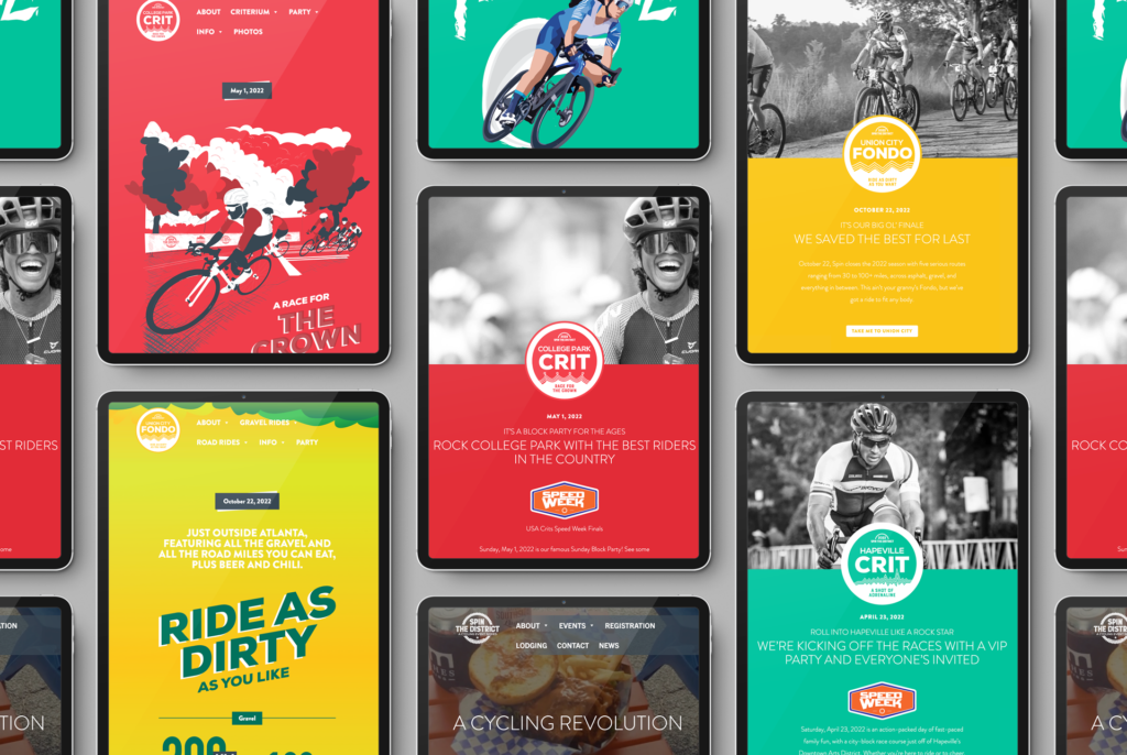
While Spin the District’s brand has remained consistent over the years, the events themselves have evolved into individual styles. Each claims one of Spin’s four brand colors as its own, paired with a unique aesthetic: clean and sleek in green for the Hapeville Crit, hand-etched in red for the College Park crit, and down and dirty in yellow for the Fondo.
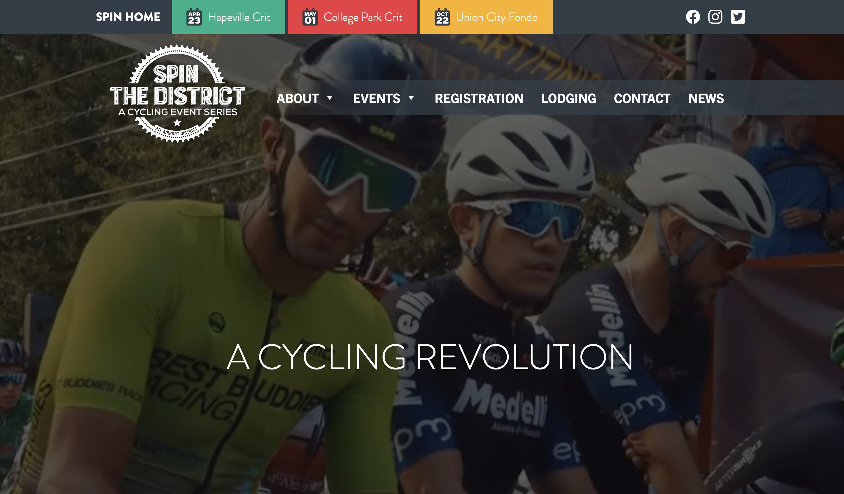
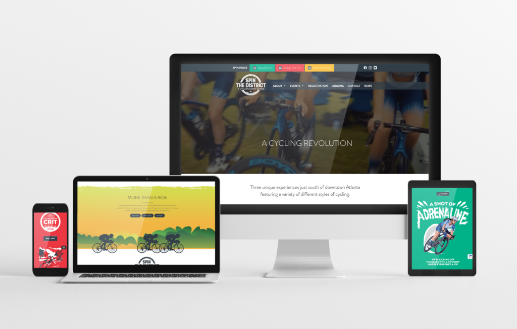
To embrace each event’s personality while ensuring a cohesive brand experience for visitors, we kept the home page perfectly true to the classic Spin look (graphic color blocks interspersed with black and white photography), while treating each event as a microsite with its own slightly deviating sub-brand. Navigation within each microsite is consistent, allowing visitors to find the same informational route through every event.
The results are in
Spin launched in 2018, powering through the pandemic years despite being a destination event in a recession that has hit the tourism, travel and event industries the hardest. Nonetheless, site analytics show a consistent growth in popularity, with site visitors traveling a clear path to learn about the events and convert to registered participants.