In 2006, Alcoa Employees and Community Credit Union, a longstanding Midwestern financial institution, needed to separate from the world’s third-largest aluminum producer. After settling on a new name and logo through an internal process, Ascentra’s VP of Marketing brought in the Ethic team to take over the development of the young brand, and we’ve been nurturing and helping it grow ever since.
A logo gets new life
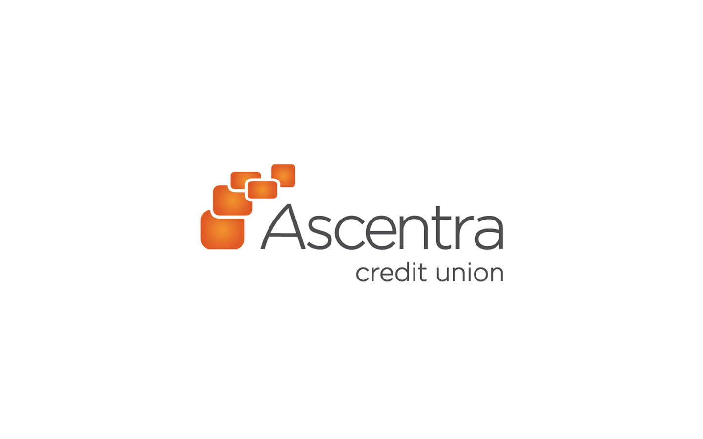
Since 2006, Ethic had struggled to use Ascentra’s logo to its full potential. From the day it was handed to us, we knew we were going to have problems. It was literally unprintable, using color transparencies that at the time struggled to be “ripped” for printing—a frustrating oversight for all concerned, amounting to a logo design that should never have been approved. With a little creativity and knowledge of the printing process, we were able to make a workable solution. As you can see from the before, the iconography looks nice and is visually appealing; using the logo in everyday life was a different matter, in that it could only be used over white. Reluctant to press for change, we worked for years with what we had.
In 2012, Ascentra brought in a new VP of Marketing who was very receptive to how we could keep the essence of the brand through a logo design refresh. In the end, the solution was relatively painless; outlines were created around the ascending bubbles and the font was beefed up to be more readable across multiple platforms. Before 2012, Ascentra and Ethic only had a few Credit Union marketing awards to pat themselves on the back with. After Ethic’s logo development, the awards are flooding in and the new, more workable logo design is the foundation for that success.